Market Structure for Chart Patterns: Trend, Support, Resistance, and Volume

Chart Patterns Course – Chapter 2 of 10. A pattern without context is like a sentence without grammar. You can stare at the letters all day and still miss the meaning. Market structure is the grammar. Trend, support, resistance, volume, and auction behaviour are what tell you whether a shape is a continuation pause, a failed auction, or just decorative noise.

Dark market structure illustration showing trend, support, resistance, and volume around a chart
Market structure gives pattern language its meaning. Without it, a breakout is just a line crossing another line.

Trend Comes First

Every pattern sits inside a larger directional state. That is where good technical analysis starts. If price is making higher highs and higher lows, your default lens should be trend continuation or trend pause until proven otherwise. If price is making lower highs and lower lows, the burden of proof is on any bullish-looking setup. If the market is chopping sideways, many patterns are simply range noise wearing a formal costume.

CME’s educational material on trend analysis is helpful here because it is blunt: trend-following signals are always somewhat late, but the late signal is often still better than pretending no trend exists. That trade-off matters. A pattern trader who refuses to classify the larger trend is basically trying to trade syntax without semantics. The shape may look correct, yet its meaning changes dramatically depending on the broader move wrapped around it.

Support and Resistance Are Zones, Not Laser Beams

Support and resistance are best understood as areas where the market has repeatedly hesitated, reversed, accelerated, or found liquidity. Retail teaching often turns them into exact lines, which is convenient for screenshot culture and terrible for live trading. Real markets breathe around levels. Stops cluster around obvious highs and lows. Limit orders rest near prior turning points. Participants remember price areas more than perfect ticks.

Carol Osler’s work at the New York Fed is one of the strongest institutional reasons not to dismiss this subject outright. Her paper on support and resistance found strong evidence that these levels helped predict intraday trend interruptions in FX. That does not mean every line on every chart matters. It means some trader-watched levels do carry real information, and the information likely exists because actual orders cluster around them.

“These tests strongly support the claim that support and resistance levels help predict intraday trend interruptions for exchange rates.” – Carol Osler, Federal Reserve Bank of New York

That finding is powerful because it moves support and resistance out of motivational-poster territory and into something closer to observable market behaviour. It also supports a key principle for the rest of this course: patterns matter more when they are anchored to levels that market participants already care about.

Volume Is Participation, Not Magic

Volume is often taught badly. Some teachers present it as a universal lie detector, as if one spike settles all debates. A better way to teach it is participation. Higher-than-normal volume suggests more market involvement in the move. That can strengthen the interpretation of a breakout, a reversal, or a rejection. Low participation does not automatically invalidate a setup, but it should make you more suspicious of aggressive conclusions.

The CMT Association’s work on volume and volatility is useful because it ties participation to context rather than mythology. Rising activity into a breakout can support the idea that the market is accepting price outside a prior range. Shrinking activity inside a congestion structure can support the idea that volatility compression is building toward expansion. The point is not to worship volume. The point is to use it as one piece of market-state evidence.

The Auction Logic Underneath Patterns

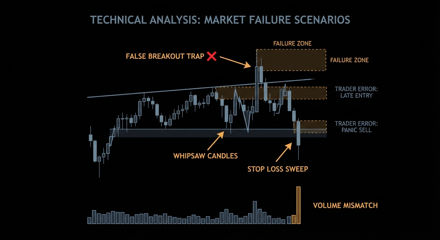
Markets are ongoing auctions. That phrase sounds academic until you map it onto chart behaviour. When buyers and sellers are in temporary balance, price rotates in a range. When one side overwhelms the other, price migrates. Patterns are visual snapshots of those shifts. A rectangle is a balance area. A breakout is attempted acceptance outside that area. A false breakout is failed acceptance, where price briefly escapes and then is dragged back inside because follow-through does not hold.

This auction perspective is more useful than simply memorising shapes because it gives you a causal story that is compatible with real order flow. Osler’s staff work on currency orders is especially valuable here. It links support, resistance, stop-loss clustering, and acceleration after breaks to actual order placement by participants. That is a much better foundation than a vague story about mysterious actors hunting retail traders for sport.

# Context-first logic
if trend_up and price_near_support_zone and participation_improving:
    look_for_continuation_or_bullish_reversal()
elif range_bound and repeated_rejection_at_highs:
    treat_breakout_or_failure_as_key_information()

Why Context Changes Pattern Meaning

Consider a triangle. Inside a strong weekly uptrend, after a sharp directional move, it may function as a continuation pause. Inside a dull sideways market, the same triangle can simply be indecision. Near a major higher-timeframe resistance zone, it may be an exhaustion structure that fails upward and reverses. The pattern did not change. The context changed. That is why market structure is not optional theory. It is the thing that determines what the pattern is trying to say.

That same rule applies to support and resistance polarity shifts. Broken resistance often becomes support, not because of a mystical law, but because prior sellers may become trapped buyers and new participants may now defend the breakout area. Broken support can become resistance for the same reason. Pattern trading works better when you understand that memory and positioning live around these zones.

What A Serious Pattern Trader Checks First

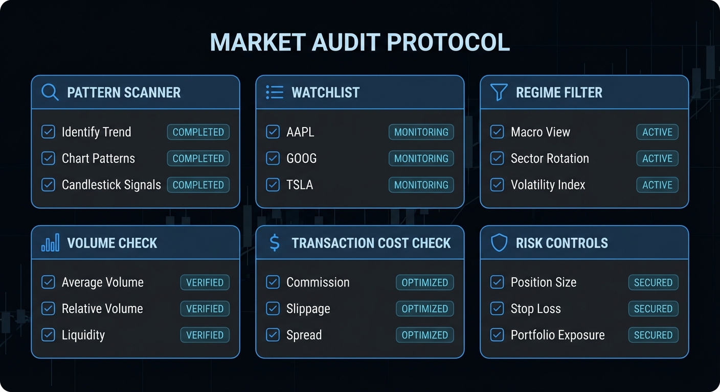
Before naming the shape, check five things. First, what is the higher-timeframe trend? Second, is the market near a meaningful zone? Third, is participation expanding, shrinking, or indifferent? Fourth, is price behaving like balance or imbalance? Fifth, is the venue itself suitable for interpretation? Futures volume tells cleaner stories than fragmented off-exchange volume in some markets. Good context work is boring, which is exactly why it saves money.

Summary Takeaway

Market structure is the context layer that makes a chart pattern interpretable. Trend, support and resistance zones, volume as participation, and auction logic all matter more than the shape alone. If you skip context, you are trading silhouettes.

Course Navigation

Previous: Chart Patterns Foundations: What They Are and What They Are Not

Next: Reversal Chart Patterns: Head and Shoulders, Double Tops, and Double Bottoms

Full course: Chart Patterns Course – Evidence, Execution, and Risk


This chapter is part of the Chart Patterns Course.

Mastering Chart Patterns: A New Course on What Actually Works

Full course here: Chart Patterns Course – Evidence, Execution, and Risk. If you want the full 10-chapter version with table of contents, previous/next chapter navigation, and dedicated lessons on risk, backtesting, and evidence, start there after this introduction.

Chart patterns are the finance equivalent of seeing constellations. Sometimes the stars really do line up, but only if you stop pretending every triangle is destiny. Fortune Talks’ long YouTube course gets one important thing right: patterns are visual summaries of supply, demand, hesitation, and breakout pressure. Where most beginner courses go wrong is turning that into a treasure map. A head and shoulders is not money. It is a conditional setup that needs trend context, participation, and disciplined execution.

Dark professional trading chart showing chart patterns, support and resistance, and breakout structures
Chart patterns are not magic shapes. They are compressed pictures of crowd behaviour, liquidity, and failed auctions.

What Chart Patterns Really Capture

At their best, chart patterns compress crowd behaviour into shapes traders can act on. Flags and triangles describe pauses inside a trend. Double tops, double bottoms, and head-and-shoulders structures describe failed auctions where one side is losing control. Andrew Lo, Harry Mamaysky, and Jiang Wang tried to move this subject from folklore to measurement by formalising pattern recognition on decades of U.S. stock data.

“over the 31-year sample period, several technical indicators do provide incremental information and may have some practical value.” – Lo, Mamaysky, and Wang, Foundations of Technical Analysis

That is the key correction to the “all patterns work” myth. The serious claim is not that geometry predicts price by magic. The serious claim is that recurring structures can shift the distribution of outcomes. Kahneman’s warning in Thinking, Fast and Slow fits perfectly here: the human brain loves fast pattern recognition, but markets punish fast certainty. A chart pattern is a hypothesis, not a verdict.

What Is the Success Rate, Actually?

The honest answer is that there is no single success rate worth tattooing on your keyboard. Results vary by market, timeframe, execution quality, fees, and whether you trade the breakout, the close, or the retest. The respectable literature says three useful things. First, patterns can contain information. Second, that information is conditional rather than universal. Third, implementation quality decides whether the edge survives transaction costs.

“These tests strongly support the claim that support and resistance levels help predict intraday trend interruptions for exchange rates.” – Carol Osler, Federal Reserve Bank of New York

Osler’s work matters because it tests signals used by real market participants rather than fantasy charts drawn after the move. More recent quantitative work reached a similar conclusion on intraday support and resistance:

“Our simple approach discovers SR levels which are able to reverse price trends statistically significantly.” – Chung and Bellotti, Evidence and Behaviour of Support and Resistance Levels in Financial Time Series

The pattern-specific evidence is mixed but not empty. In research on U.S. equities, Savin, Weller, and Zvingelis reported that head-and-shoulders signals improved risk-adjusted returns when used conditionally, but they did not support a naive stand-alone trading religion. That is the real lesson. Patterns can add information. They rarely deserve to be your entire trading system.

The Failure Cases Beginners Learn the Hard Way

Case 1: Entering before the breakout is confirmed

The video correctly emphasises breakout logic. The trap is anticipation. Traders see an ascending triangle, jump early, and call it conviction. The market calls it liquidity.

# Bad: trade the pattern before confirmation
if pattern == "ascending_triangle":
    buy()

# Better: require a decisive close and participation
if pattern == "ascending_triangle" and close > resistance and volume > 1.5 * avg_volume_20:
    buy()

Premature entries convert a probabilistic setup into a coin flip with worse pricing.

Case 2: Ignoring the higher timeframe regime

A bullish flag inside a clean weekly uptrend is not the same object as a bullish flag under a falling 200-day moving average. One is continuation. The other is often a dead-cat drawing with better marketing.

# Bad: every flag gets treated equally
signal = detect_flag(data)

# Better: trade with regime
signal = detect_flag(data)
trend_ok = close > ema_50 and ema_50 > ema_200
if signal and trend_ok:
    buy()

Case 3: Pretending measured-move targets beat transaction costs by default

This is where most course material becomes decorative. A 1.2R setup on a noisy intraday chart can look beautiful and still be useless after spread, slippage, and misses.

# Bad: fixed tiny edge, no cost check
gross_r = (target - entry) / (entry - stop)
take_trade = gross_r > 0

# Better: trade only if net expectancy survives costs
cost_in_r = spread_cost + slippage_cost + missed_fill_cost
gross_r = (target - entry) / (entry - stop)
net_edge = gross_r - cost_in_r
if gross_r >= 1.8 and net_edge > 0:
    take_trade = True

This is the part beginners skip because it is less exciting than spotting a cup and handle. It is also the part that decides whether you stay in the game.

Dark technical chart illustrating false breakouts, stop sweeps, and failed pattern trades
Most pattern failures are implementation failures: early entry, wrong regime, or a cost structure that eats the edge.

Best Ways to Implement Chart Patterns in Practice

If you actually want to use the ideas from the course, do it like a process engineer, not a pattern tourist. Restrict yourself to liquid instruments. Start with regime classification. Define the trigger mechanically. Require confirmation. Then place the stop where the thesis is invalidated, not where your ego gets uncomfortable. The video is right that timeframes matter: daily and four-hour structures are usually more reliable than frantic one-minute pattern hunting because more participants see them and cost drag is smaller.

Step 1: Restrict the universe. Focus on liquid names or liquid index products.

Step 2: Start with regime. Continuation patterns need trend persistence; reversal patterns need exhaustion plus failed follow-through.

Step 3: Define the trigger mechanically. Use a closing break beyond the boundary, a retest rule, or both.

Step 4: Require confirmation. Volume expansion and volatility contraction before breakout help filter noise.

Step 5: Size the trade from the stop. Risk per trade should be fixed before the order is sent.

def trade_pattern(pattern, data):
    if not pattern.confirmed_close:
        return None
    if not data.regime_is_aligned:
        return None
    if data.breakout_volume < 1.5 * data.avg_volume_20:
        return None
    entry = data.close
    stop = pattern.invalidation_level
    target = entry + 2 * (entry - stop)
    return {"entry": entry, "stop": stop, "target": target}
Dark professional diagram showing trend filter, breakout confirmation, retest, stop loss and target rules
A useful chart pattern is a checklist with an invalidation level, not a doodle with hope attached.

When Chart Patterns Are Actually Fine

Chart patterns are perfectly respectable when used as a language for trade location, watchlist construction, and risk definition. They are especially useful for swing traders who need a structured way to organise entries and invalidation points. They are much less convincing as a stand-alone alpha source in fast, fee-heavy intraday trading. Put differently: patterns work better as a decision framework than as a superstition.

Dark finance checklist graphic for reviewing chart patterns, cost checks, and risk controls
If you cannot explain the regime, trigger, invalidation, and cost assumptions, you do not have a setup yet.

What to Check Right Now

  • Backtest one pattern at a time with real spreads and slippage before adding it to your playbook.
  • Separate continuation from reversal setups because their failure mechanics are different.
  • Track expectancy, not just win rate. A lower win rate can still be superior if average winners are materially larger than average losers.
  • Use daily or four-hour charts first if you are learning. Higher timeframes usually mean cleaner structure and lower cost drag.
  • Review every false breakout to see whether volume, regime, or liquidity should have filtered it out.

Video Attribution

This article builds on the educational YouTube course below and adds the quantitative evidence, implementation rules, and failure analysis that most chart-pattern tutorials leave out.


Watch the original Fortune Talks video on YouTube.

nJoy 😉