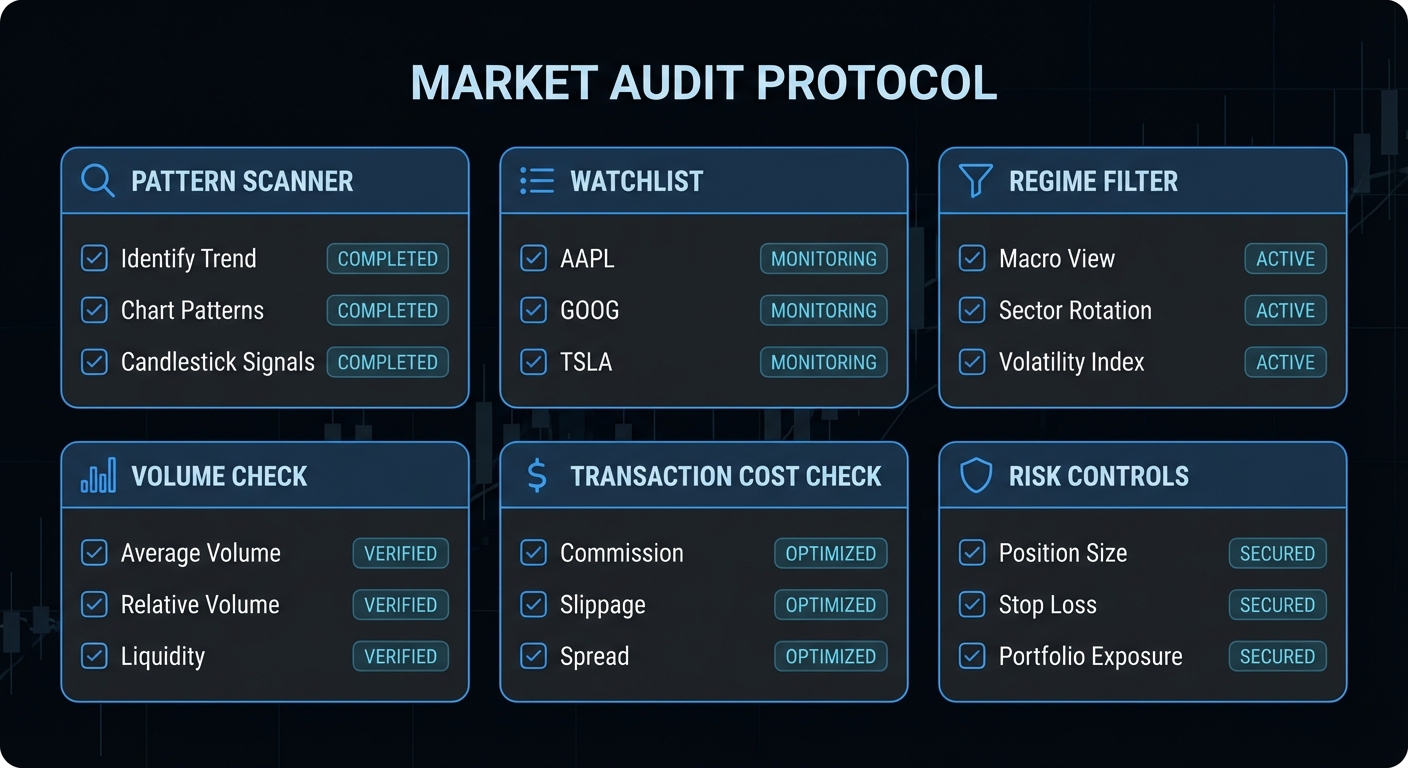
Chart Patterns Course – Chapter 1 of 10. Before you learn flags, triangles, or head and shoulders, you need a clean definition of what a chart pattern actually is. That sounds obvious until you realise most pattern education begins by showing the shape after the move worked. At that point you are no longer learning analysis. You are learning archaeology.
A chart pattern is not a prophecy. It is a structured picture of how buyers and sellers behaved over a stretch of time.
What A Chart Pattern Is
A chart pattern is a recurring price structure that traders use to describe balance, imbalance, continuation, or reversal in a market. That definition matters because it keeps the subject grounded. A pattern is descriptive before it is predictive. It summarises how price moved, where it hesitated, where it failed, and where control may be shifting. A triangle is not a mystical force field. A double top is not a commandment. They are compact visual descriptions of crowd behaviour.
This is also why patterns remain popular. Human beings are very good at recognising structure in incomplete information. Markets generate streams of incomplete information. The temptation to draw meaning out of shape is almost irresistible. Daniel Kahneman would probably call this a perfect factory for overconfident intuition: the chart gives you just enough order to feel certain, even when the evidence is only conditional. That does not make chart patterns useless. It means they need rules, context, and humility.
The Real Academic Claim
Serious research on chart patterns does not say, “all these shapes work.” The strongest careful claim is much smaller and much more useful. Andrew Lo, Harry Mamaysky, and Jiang Wang tried to formalise technical analysis by turning pattern recognition into something computational rather than purely subjective. Their result is still one of the best starting points for anyone who wants evidence instead of campfire stories.
Notice the wording. Incremental information. Some practical value. That is the grown-up version of the subject. It does not promise easy profits. It does not tell you to buy every breakout. It tells you that some recurring structures shift the distribution of outcomes enough to be worth studying. That is a different proposition from folklore, and a far more defensible one.
Why Subjectivity Is the Main Problem
The biggest weakness in chart-pattern education is not that charts are visual. It is that the rules are often vague enough to absorb hindsight. If five traders can draw five different necklines on the same head and shoulders, then the pattern is not yet operational. If the pattern is only obvious after the move reaches the target, then it is not teaching you to trade, it is teaching you to narrate what already happened.
That is why this course treats pattern recognition as a rules problem. You need answers to simple questions: What prior trend is required? What pivots define the structure? What counts as confirmation? Where is the pattern invalidated? What timeframe is relevant? What costs are assumed? Without those answers, the pattern is just a story generator with a candlestick habit.
# Bad pattern logic
if "looks like a triangle":
    buy()

# Better pattern logic
if prior_trend_up and range_contracting and close > resistance and invalidation_defined:
    buy()
That tiny shift in language matters. It moves the pattern from shape worship to conditional decision-making. The first version is a vibe. The second version is a hypothesis that can be tested.
Why Patterns Survive Anyway
Chart patterns survive for three reasons. First, markets do produce recurring structures because humans respond to gains, losses, regret, and crowd behaviour in recurring ways. Second, many participants do watch the same levels, which means some pattern behaviour can become partially self-reinforcing. Third, patterns are genuinely useful for organising trade location and risk. Even when a pattern does not provide a large standalone edge, it can still help define a trigger, an invalidation point, and a reward-to-risk framework.
This is where classic technical-analysis texts still matter. John Murphy and Edwards and Magee remain useful for vocabulary and taxonomy. They help describe what traders mean by reversal, continuation, neckline, support, and measured move. They are not enough as empirical proof on their own, but they remain useful because a course still needs a language. The mistake is confusing the existence of a language with the existence of a guaranteed edge.
What Not To Claim
If you want to stay intellectually honest, avoid three bad claims. First: do not say patterns “always work” in liquid markets. They do not. Second: do not say every false breakout is deliberate manipulation. Sometimes it is simply poor follow-through in a noisy auction. Third: do not present a single success rate as if it applies across assets, regimes, and execution styles. A daily chart breakout in an index future and a one-minute crypto wedge on a thin Sunday book are not the same animal.
Carol Osler’s work on support and resistance is a good warning against simplistic thinking. Her research gives serious support to the idea that technician-used levels can matter, particularly in FX, but it does not give you permission to turn every hand-drawn line into divine revelation. The adult version of technical analysis is conditional, market-specific, and implementation-aware.
How To Think About Patterns From Here
The cleanest mental model is this: patterns are compact maps of auction behaviour. Some show compression inside trend. Some show repeated failure at extremes. Some show exhaustion after a directional move. Their value comes from combining structure with context, confirmation, and risk logic. Used that way, they are useful. Used as free-floating shapes, they become one more way the market sells certainty to people who desperately want it.
Summary Takeaway
Chart patterns are best treated as structured hypotheses about market behaviour, not as magical predictors. The evidence supports modest informational value in some cases, but only when definitions, context, confirmation, and execution are handled with discipline.
Chart Patterns Course – Chapter 3 of 10. Reversal patterns are where chart education usually becomes theatrical. Everyone loves a head and shoulders because it looks tidy, sounds dramatic, and gives the impression that the market has politely arranged itself into a labelled diagram for your benefit. Real reversals are messier than that. They begin with exhaustion, continue through failed continuation attempts, and only become tradable once confirmation appears.
A reversal pattern is not complete when the shape appears. It is complete when continuation fails and the market confirms the change.
Prior Trend Is Not Optional
A reversal pattern needs something to reverse. That sounds embarrassingly obvious, yet it is one of the most common beginner errors. Traders call every small zig-zag a double top or every slight bounce a double bottom, even when the market has not produced a meaningful prior move. Without prior trend, a reversal pattern is often just range noise. At best it is an ambiguous congestion. At worst it is a trap that invites you to short support or buy resistance in the middle of a sideways mess.
This is why good reversal analysis begins with context. The shape comes second. If the market has been in a mature uptrend, then repeated failure near a high matters. If the market has been in a downtrend, then accumulation near lows matters. Pattern geometry only earns meaning after directional context has established tension.
Head and Shoulders: Failure in Three Acts
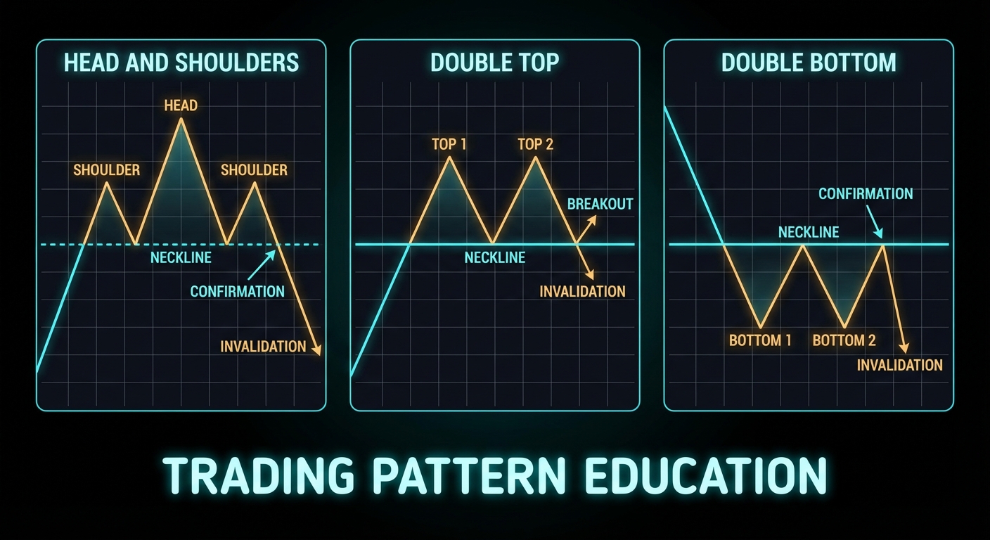
The head and shoulders pattern is best understood as a three-stage failure sequence. The left shoulder shows an initial loss of momentum after a strong advance. The head makes a higher high, but that higher high cannot sustain itself. The right shoulder then fails to make a convincing new extreme. What matters most is not the silhouette. It is the repeated inability of buyers to extend control, followed by a break of the neckline that signals the market is no longer treating the prior uptrend as intact.
This distinction matters because students often enter too early. They see the head and shoulder structure forming and start shorting before the neckline gives way. That is anticipation, not confirmation. Sometimes anticipation works. It also exposes you to the exact risk that the market simply consolidates and then resumes upward. Confirmation costs you some price, but it buys you information. In live trading, information is a very good use of money.
The inverse head and shoulders is the mirror image. Sellers progressively fail to extend the downtrend. The market builds a deeper central low, then refuses to follow through lower on the right side. When the neckline breaks upward, the prior auction logic has changed. Again, the key event is the break, not the art project.
Double Tops and Double Bottoms
Double tops and double bottoms are simpler patterns, but they are often abused because the structure looks so easy to recognise. A double top is not simply “price hit the high twice.” It is repeated failure at an extreme, followed by a break of the intervening swing low that confirms the market is willing to trade lower. A double bottom is the reverse: repeated defence near a low, then a break of the swing high between the lows. Without that confirmation level breaking, the pattern remains incomplete.
This is the central teaching point for reversal structures: the market must prove the transition. Until then, you have a possible setup, not a completed one. Many bad trades come from confusing the possibility of reversal with the fact of reversal.
What The Evidence Says
Pattern-specific evidence is thinner than the textbooks imply, but it is not empty. One of the strongest direct studies on a named pattern comes from Savin, Weller, and Zvingelis on head and shoulders in U.S. equities. Their results are exactly the kind of nuance this course wants to preserve: not a blanket endorsement, not a blanket dismissal.
The study did not support a naive “trade every head and shoulders and get rich” interpretation. What it did support was conditional predictive value and improved risk-adjusted results when the structure was used more carefully. That is a recurring theme across respectable chart-pattern research. The shape may carry information, but the value is conditional, implementation-sensitive, and rarely as clean as the retail versions claim.
Lo, Mamaysky, and Wang provide the broader academic umbrella for this idea by showing that technical structures such as head and shoulders and double bottoms can provide incremental information. Again, modest claim, useful claim. Not magical claim.
Where Reversal Patterns Fail
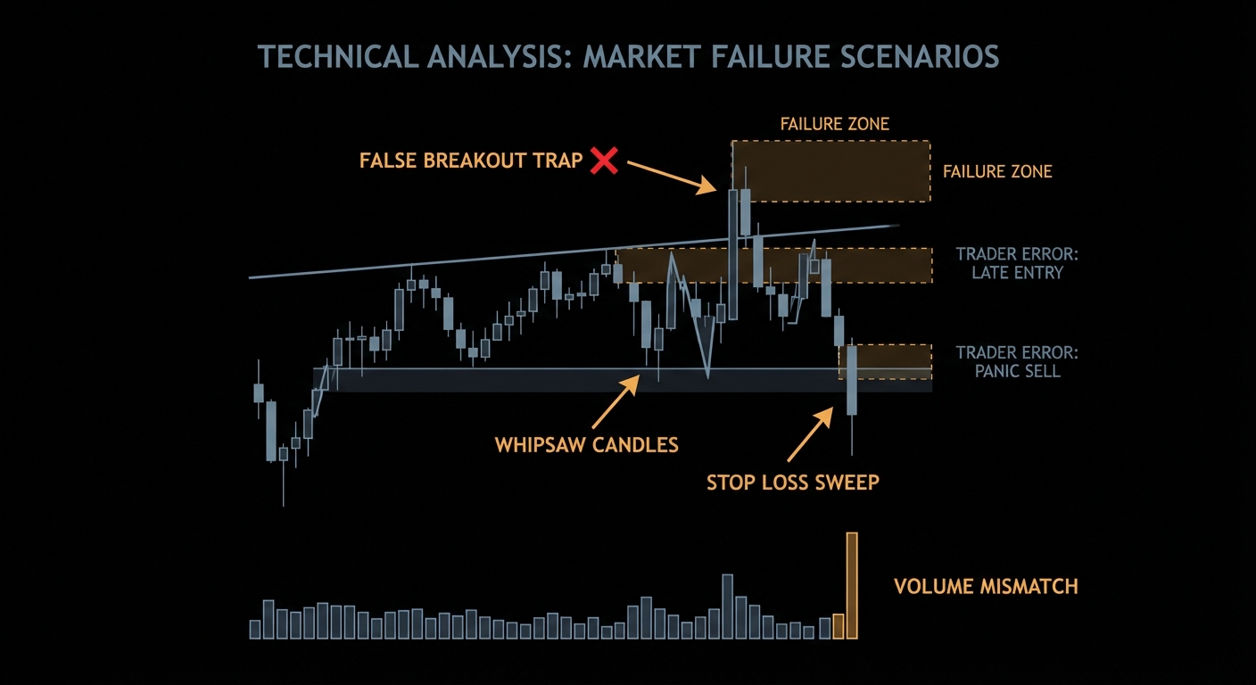
Reversal patterns fail in predictable ways. First, traders enter before confirmation. Second, the prior trend was too weak or too short to matter. Third, the setup forms directly into strong higher-timeframe support or resistance, which means the supposed reversal is actually running into a larger opposing force. Fourth, traders ignore participation and follow-through. A neckline break on weak involvement can still work, but it deserves more caution than a break with strong market acceptance.
# Weak reversal logic
if pattern == "head_and_shoulders":
    short()

# Better reversal logic
if prior_trend_up and neckline_break and follow_through_present:
    short()
There is also a deeper lesson here: failed reversal patterns can become powerful continuation signals. If a beautiful head and shoulders cannot break down and instead reclaims the neckline aggressively, that failure tells you something important. The market has absorbed the bearish story and refused to comply. In trading, failed signals are often as informative as successful ones.
Measured Moves and Invalidation
Classic texts often teach measured-move targets by projecting the height of the pattern from the breakout point. That can be useful as a planning device. It is not a law of nature. The measured move is a heuristic for thinking about potential reward, not an exact destination. Invalidation is more important than target mythology. If the market reclaims the neckline after a downside break or collapses back below it after an inverse breakout, your thesis is degrading and your risk should already be defined.
How To Trade Them Like An Adult
A serious reversal trader asks four questions. Was there a real prior trend? Is the pattern complete or merely forming? Is the confirmation level clear? Is the invalidation level clear? If the answer to any of those is vague, you probably do not have a trade. That discipline feels less exciting than calling tops on social media. It is also much more compatible with long-term survival.
Summary Takeaway
Reversal patterns are best understood as failed continuation structures that become tradable only after confirmation. Prior trend, break of the confirmation level, and clear invalidation matter far more than how aesthetically pleasing the pattern looks on a screenshot.
Chart Patterns Course – Chapter 6 of 10. A pattern does not live on a chart. It lives on a timeframe inside a market regime. That sentence explains a shocking number of trading disasters. The same bull flag can be a sensible continuation setup on a daily chart inside a weekly uptrend and a complete waste of attention on a one-minute chart inside a thin, whippy session. Timeframe and regime decide whether the pattern deserves your energy at all.
The same shape means different things across horizons. Timeframe and regime are the difference between pattern context and pattern hallucination.
Why Higher Timeframes Usually Behave Better
Beginners are often attracted to lower timeframes because they seem exciting, active, and full of opportunity. They are also full of noise, cost drag, and microstructure distortion. Research on high-frequency market microstructure makes this point clearly: the lower the horizon, the more price is distorted by bid-ask bounce, short-term order imbalances, and other effects that have very little to do with the clean textbook pattern you think you are trading.
That is why higher timeframes often produce more teachable pattern behaviour. Not because the market suddenly becomes honest, but because the structural signal is larger relative to the noise and costs. A daily triangle or four-hour rectangle usually gives you a cleaner relationship between structure, invalidation, and reward than a frenetic one-minute pattern that lives inside spread and slippage.
Regime Filters Are Not Cosmetic
Continuation patterns depend on continuation. That sounds trivial, but it means they are deeply regime-dependent. Trend-following research from AQR and related work across asset classes supports a broad fact: own-price trends can persist across intermediate horizons. That does not prove every triangle works. It does tell you that a market in persistent trend is fundamentally a better home for continuation logic than a market whipsawing inside a mean-reverting chop zone.
Regime filters are the bridge from that evidence to practical trading. You can define regime using moving-average alignment, price relative to a long-term average, volatility state, momentum state, or a simple higher-high/higher-low structure. The exact filter matters less than the discipline of having one. The point is to ask “what kind of market am I in?” before asking “what does this pattern mean?”
Multi-Timeframe Thinking
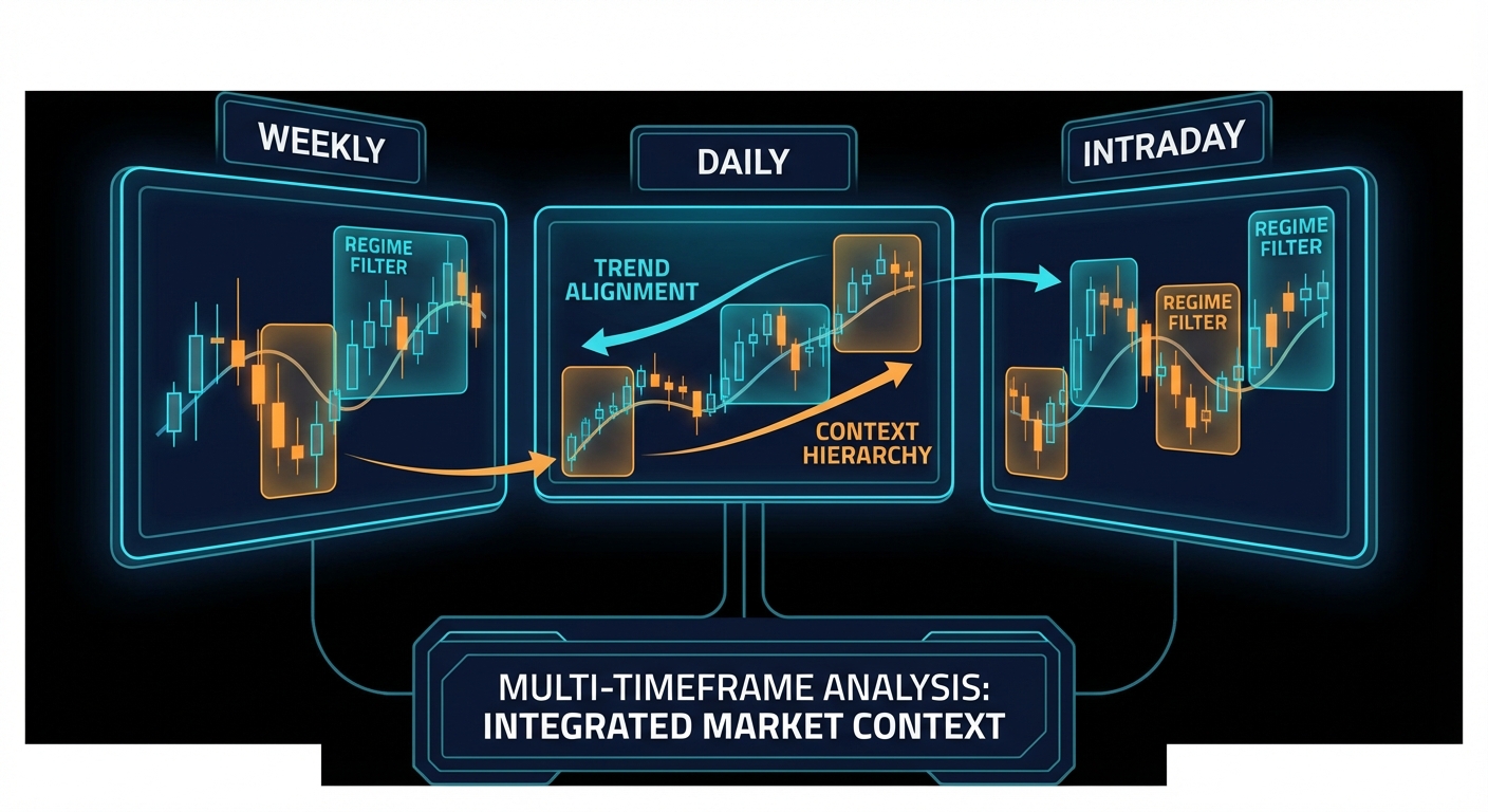
A robust pattern process often uses two horizons. The higher timeframe establishes directional bias and major levels. The lower timeframe handles execution. For example, you might identify a weekly uptrend and daily consolidation, then use a four-hour breakout for entry. This avoids one of the classic retail errors: making every decision from a single chart and acting surprised when a beautiful local setup runs directly into a much larger zone visible one screen up.
Multi-timeframe thinking does not require excessive complexity. It only requires hierarchy. One timeframe tells you the environment. Another tells you the trigger. If those two disagree violently, smaller size or no trade is often the correct response.
Signal Strength Matters
Another useful lesson from the trend-following literature is that signal quality varies. Some trends are mature, broad, and persistent. Others are fragile, late, or already near exhaustion. Research on trend signal strength and CTA performance is helpful here because it reinforces a key trading intuition: directional bias alone is not enough. Strong trends and weak trends should not be treated as the same object.
Translated into pattern trading, this means a continuation pattern in a strong, orderly trend deserves more respect than the same shape inside a hesitant, news-whipped environment. Likewise, a reversal pattern against a powerful established trend deserves extra caution unless other evidence of exhaustion is present.
# Simple regime-aware filter
trend_up = close > ema_50 and ema_50 > ema_200
volatility_ok = atr_percentile < max_threshold

if trend_up and volatility_ok and breakout_confirmed:
    take_trade()
When Timeframes Work Against You
Higher timeframes are not automatically superior in every way. They reduce noise, but they also reduce sample size and can react slowly to turning points. Lower timeframes provide more opportunities, but those opportunities are more vulnerable to friction and false signals. This is why no timeframe should be marketed as “the best.” The question is best for what. Swing traders looking for structured continuation may prefer daily and four-hour charts. Intraday traders may need lower horizons, but they should accept that pattern quality degrades and execution quality becomes much more important.
Context Changes The Same Pattern
A rectangle after a parabolic run may be distribution. The same rectangle early in a stable trend may be healthy balance. A double bottom in a long-term downtrend may be just another bounce until the higher timeframe agrees. A breakout from a triangle during a macro event week may be less about the triangle and more about the event. Regime awareness forces you to stop treating the pattern as the main character in a market that is often being driven by larger forces.
This chapter also rescues you from one of the most common retail delusions: the belief that more charts mean more clarity. Often the opposite is true. The extra clarity comes from choosing the right horizon and letting the wrong ones go.
A Default Workflow That Actually Works
A sensible course default is simple. Use the weekly or daily chart for directional bias and major levels. Use the four-hour or daily chart for setup structure. Use a still lower timeframe only if you need execution refinement and you already know the broader context. That hierarchy is not glamorous, but it keeps you from getting hypnotised by noise. It also reinforces a deep truth: regime is not an optional add-on to pattern trading. It is the environment that decides whether the pattern deserves to exist in your process at all.
Summary Takeaway
Timeframe and regime determine whether a chart pattern is meaningful, noisy, or actively misleading. Higher-level context, trend state, and signal strength should be established before you start naming shapes and planning entries.
Chart Patterns Course – Chapter 9 of 10. The difference between a pattern enthusiast and a systems thinker is simple: one says “that looks like a setup,” the other asks “can I define it, scan it, test it, and survive the parts I did not think about?” This chapter is about making the jump from visual impression to operational rule set.
A pattern is not testable until its geometry, trigger, costs, and execution assumptions are explicit.
Detection Is Not Execution
The first mistake in pattern system design is treating detection and execution as the same problem. They are not. Detection asks whether a shape exists according to a set of rules. Execution asks whether, given that detection, you should trade now, how, and under which constraints. A scanner can be excellent at finding triangles and still be useless as a trading engine if the execution logic is naive.
Lo, Mamaysky, and Wang matter here for a second time because they show what real progress looks like: formal definitions. Once the shape is defined computationally, you can stop arguing over screenshots and start testing behaviour. But even then, you are only halfway done. The pattern exists is not the same statement as the trade is attractive.
How To Formalise A Pattern
A usable rule set needs geometry and state. Geometry includes pivot structure, slope, duration, and relative highs and lows. State includes trend context, volatility condition, participation, and the rule for confirmation. For example, a triangle might require at least three touches, contracting range, a prior trend, and a close outside the boundary. A double top might require two comparable highs, a confirmed swing low between them, and a break of that swing low to trigger the idea. The exact rules can vary, but the point is that they must exist.
if prior_trend_up and pivots_valid and range_contracting and close > upper_boundary:
    signal = "triangle_breakout"
else:
    signal = None
That logic is still only a start. You then need to specify stop logic, profit logic, time stop, entry order type, universe filter, and what happens when multiple signals overlap. Backtests become untrustworthy surprisingly fast once any of those details remain vague.
Scanners Need Filters Before Patterns
A good scanner filters liquidity, spread, price, average volume, and perhaps regime before it even looks for patterns. Otherwise it will happily find beautiful setups in instruments you should never trade. This is one of the reasons discretionary traders sometimes distrust quant work. They have seen systems that detect elegant structures in statistically filthy places. The answer is not to reject automation. It is to respect preconditions.
For a chart-pattern course, the operational lesson is that scanning logic should serve tradeability, not just detection accuracy. A scanner that finds hundreds of weak candidates creates false confidence and false labour. A smaller list of liquid, structurally valid, context-aligned setups is far more valuable.
Backtest Overfitting Is a Real Threat
If you test enough patterns, filters, and thresholds on the same dataset, one of them will look brilliant. That is not proof of edge. That is often proof that statistics can be flattered when left unsupervised. This is where data-snooping literature, White’s reality check, and work on the probability of backtest overfitting become essential guardrails. The best-looking equity curve in-sample is often the most dangerous object in the room.
The antidotes are old-fashioned and effective: out-of-sample testing, walk-forward validation, realistic costs, and restraint in the number of variants explored. A backtest should not be allowed to audition endlessly until it finds the exact rule combination that history happened to reward.
Execution Assumptions Matter More Than People Admit
Best-execution guidance from FINRA and investor education from the SEC are useful here even if you are not building institutional routing systems. They force you to recognise that execution quality is a variable, not a rounding error. A breakout strategy using market orders behaves differently from the same strategy using limit orders. The difference is not cosmetic. It changes fill probability, slippage, missed opportunity, and realised expectancy.
If your backtest says every breakout was filled at the level with no delay and no slippage, you are not testing the strategy. You are testing your affection for fiction. Execution assumptions belong in the rules, not in a footnote after the results table.
What To Report From A Pattern Test
A serious chart-pattern backtest should report more than CAGR and win rate. It should include expectancy, max drawdown, turnover, holding period, average adverse excursion, average favourable excursion, exposure, capacity concerns, and performance by regime. If a pattern only works during one volatility state, that is not a flaw. It is information. But you only get that information if you ask better questions than “green line up?”
Why Rule-Based Work Improves Discretion Too
Even discretionary traders benefit from this chapter because rule-writing exposes vague thinking. Once you try to formalise your favourite setup, you quickly discover which parts were truly repeatable and which parts were just confidence with nice lighting. In that sense, backtesting is not only a profit exercise. It is an honesty exercise.
From Rules Back To Discretion
There is an irony here that good traders eventually appreciate. The more carefully you formalise a pattern setup, the better your discretionary judgement often becomes. Once you know exactly what the clean version looks like, you become much better at spotting when the live market is giving you a degraded imitation. That is why writing rules is not a betrayal of discretionary skill. It is one of the best ways to refine it.
That is also why a scanner should never be judged only by how many setups it finds. The better question is whether it helps you reject weak trades faster and define strong trades more consistently. In real pattern trading, filtering is often more valuable than discovery.
Summary Takeaway
Turning chart patterns into rules means defining the geometry, the trigger, the filter, the costs, and the execution path explicitly. A pattern is only testable and tradable when detection and execution are both specified with discipline.
Full course here:Chart Patterns Course – Evidence, Execution, and Risk. If you want the full 10-chapter version with table of contents, previous/next chapter navigation, and dedicated lessons on risk, backtesting, and evidence, start there after this introduction.
Chart patterns are the finance equivalent of seeing constellations. Sometimes the stars really do line up, but only if you stop pretending every triangle is destiny. Fortune Talks’ long YouTube course gets one important thing right: patterns are visual summaries of supply, demand, hesitation, and breakout pressure. Where most beginner courses go wrong is turning that into a treasure map. A head and shoulders is not money. It is a conditional setup that needs trend context, participation, and disciplined execution.
Chart patterns are not magic shapes. They are compressed pictures of crowd behaviour, liquidity, and failed auctions.
What Chart Patterns Really Capture
At their best, chart patterns compress crowd behaviour into shapes traders can act on. Flags and triangles describe pauses inside a trend. Double tops, double bottoms, and head-and-shoulders structures describe failed auctions where one side is losing control. Andrew Lo, Harry Mamaysky, and Jiang Wang tried to move this subject from folklore to measurement by formalising pattern recognition on decades of U.S. stock data.
That is the key correction to the “all patterns work” myth. The serious claim is not that geometry predicts price by magic. The serious claim is that recurring structures can shift the distribution of outcomes. Kahneman’s warning in Thinking, Fast and Slow fits perfectly here: the human brain loves fast pattern recognition, but markets punish fast certainty. A chart pattern is a hypothesis, not a verdict.
What Is the Success Rate, Actually?
The honest answer is that there is no single success rate worth tattooing on your keyboard. Results vary by market, timeframe, execution quality, fees, and whether you trade the breakout, the close, or the retest. The respectable literature says three useful things. First, patterns can contain information. Second, that information is conditional rather than universal. Third, implementation quality decides whether the edge survives transaction costs.
“These tests strongly support the claim that support and resistance levels help predict intraday trend interruptions for exchange rates.” – Carol Osler, Federal Reserve Bank of New York
Osler’s work matters because it tests signals used by real market participants rather than fantasy charts drawn after the move. More recent quantitative work reached a similar conclusion on intraday support and resistance:
The pattern-specific evidence is mixed but not empty. In research on U.S. equities, Savin, Weller, and Zvingelis reported that head-and-shoulders signals improved risk-adjusted returns when used conditionally, but they did not support a naive stand-alone trading religion. That is the real lesson. Patterns can add information. They rarely deserve to be your entire trading system.
The Failure Cases Beginners Learn the Hard Way
Case 1: Entering before the breakout is confirmed
The video correctly emphasises breakout logic. The trap is anticipation. Traders see an ascending triangle, jump early, and call it conviction. The market calls it liquidity.
# Bad: trade the pattern before confirmation
if pattern == "ascending_triangle":
    buy()

# Better: require a decisive close and participation
if pattern == "ascending_triangle" and close > resistance and volume > 1.5 * avg_volume_20:
    buy()
Premature entries convert a probabilistic setup into a coin flip with worse pricing.
Case 2: Ignoring the higher timeframe regime
A bullish flag inside a clean weekly uptrend is not the same object as a bullish flag under a falling 200-day moving average. One is continuation. The other is often a dead-cat drawing with better marketing.
# Bad: every flag gets treated equally
signal = detect_flag(data)

# Better: trade with regime
signal = detect_flag(data)
trend_ok = close > ema_50 and ema_50 > ema_200
if signal and trend_ok:
    buy()
Case 3: Pretending measured-move targets beat transaction costs by default
This is where most course material becomes decorative. A 1.2R setup on a noisy intraday chart can look beautiful and still be useless after spread, slippage, and misses.
This is the part beginners skip because it is less exciting than spotting a cup and handle. It is also the part that decides whether you stay in the game.
Most pattern failures are implementation failures: early entry, wrong regime, or a cost structure that eats the edge.
Best Ways to Implement Chart Patterns in Practice
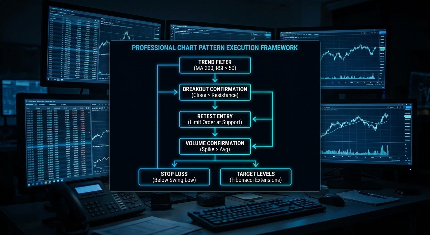
If you actually want to use the ideas from the course, do it like a process engineer, not a pattern tourist. Restrict yourself to liquid instruments. Start with regime classification. Define the trigger mechanically. Require confirmation. Then place the stop where the thesis is invalidated, not where your ego gets uncomfortable. The video is right that timeframes matter: daily and four-hour structures are usually more reliable than frantic one-minute pattern hunting because more participants see them and cost drag is smaller.
Step 1: Restrict the universe. Focus on liquid names or liquid index products.
Step 2: Start with regime. Continuation patterns need trend persistence; reversal patterns need exhaustion plus failed follow-through.
Step 3: Define the trigger mechanically. Use a closing break beyond the boundary, a retest rule, or both.
Step 4: Require confirmation. Volume expansion and volatility contraction before breakout help filter noise.
Step 5: Size the trade from the stop. Risk per trade should be fixed before the order is sent.
def trade_pattern(pattern, data):
    if not pattern.confirmed_close:
        return None
    if not data.regime_is_aligned:
        return None
    if data.breakout_volume < 1.5 * data.avg_volume_20:
        return None
    entry = data.close
    stop = pattern.invalidation_level
    target = entry + 2 * (entry - stop)
    return {"entry": entry, "stop": stop, "target": target}
A useful chart pattern is a checklist with an invalidation level, not a doodle with hope attached.
When Chart Patterns Are Actually Fine
Chart patterns are perfectly respectable when used as a language for trade location, watchlist construction, and risk definition. They are especially useful for swing traders who need a structured way to organise entries and invalidation points. They are much less convincing as a stand-alone alpha source in fast, fee-heavy intraday trading. Put differently: patterns work better as a decision framework than as a superstition.
If you cannot explain the regime, trigger, invalidation, and cost assumptions, you do not have a setup yet.
What to Check Right Now
Backtest one pattern at a time with real spreads and slippage before adding it to your playbook.
Separate continuation from reversal setups because their failure mechanics are different.
Track expectancy, not just win rate. A lower win rate can still be superior if average winners are materially larger than average losers.
Use daily or four-hour charts first if you are learning. Higher timeframes usually mean cleaner structure and lower cost drag.
Review every false breakout to see whether volume, regime, or liquidity should have filtered it out.
Video Attribution
This article builds on the educational YouTube course below and adds the quantitative evidence, implementation rules, and failure analysis that most chart-pattern tutorials leave out.
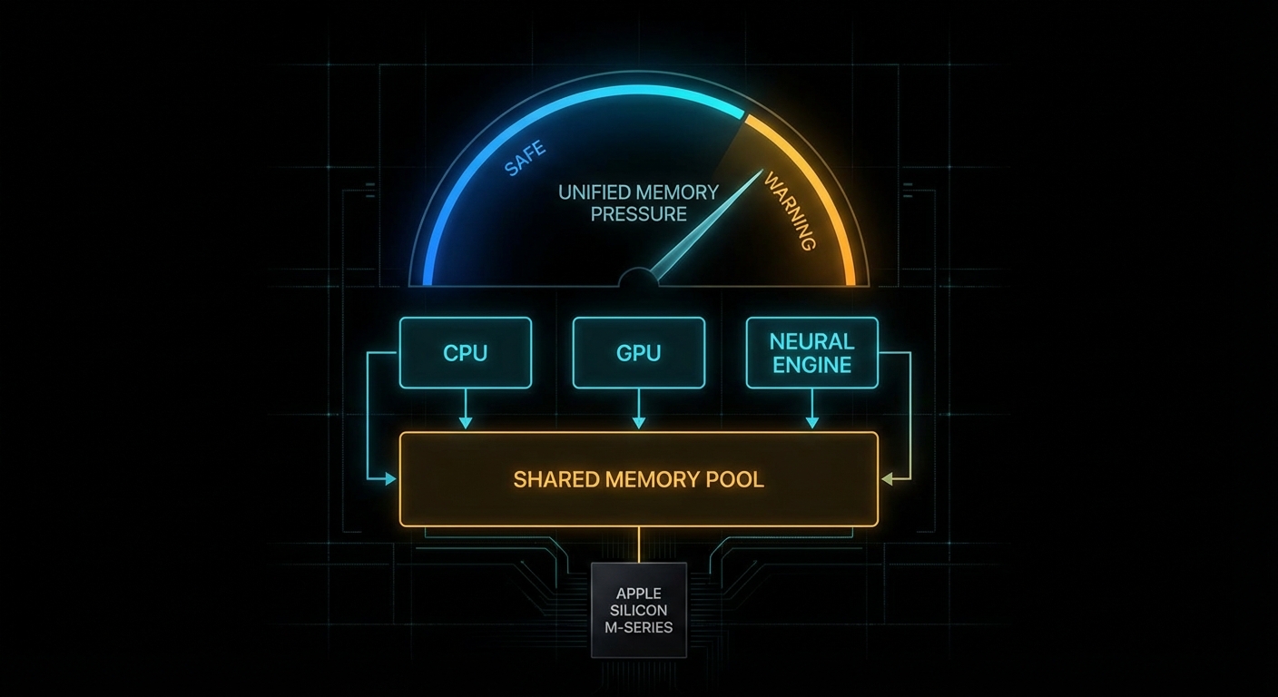
There is a particular kind of modern disappointment that only happens on an Apple Silicon Mac. You have 16 GB of unified memory, your model file is “only” 11 GB on disk, LM Studio looks optimistic for a moment, and then the load fails like a Victorian gentleman fainting at the sight of a spreadsheet. The internet calls this “hidden VRAM”. That phrase is catchy, but it is also slightly nonsense. Your Mac does not have secret gamer VRAM tucked behind the wallpaper. What it has is a shared memory pool and a tunable guardrail for how much of that pool the GPU side of the system is allowed to wire down. Move the guardrail carefully and some local LLMs that previously refused to load will suddenly run. Move it carelessly and your machine turns into a very expensive beachball generator.
This is not free VRAM. It is a movable fence inside a shared pool.
The practical knob is iogpu.wired_limit_mb. On this 16 GB Apple Silicon Mac, the default is still the default from the video:
That 0 means “use the system default policy”, not “unlimited”. For people running local models, that distinction matters. The interesting bit is that the policy is often conservative enough that a model which should fit on paper does not fit in practice once GPU allocations, KV cache, context length, the window server, and ordinary macOS overhead all take their cut. The result is a very familiar sentence: failed to load model.
What This Setting Actually Changes
Apple’s architecture is the key to understanding why this works at all. Unlike a desktop PC with separate system RAM and discrete GPU VRAM, Apple Silicon uses one shared pool. Apple says it plainly:
That one sentence explains both the magic and the pain. The magic is that Apple laptops and minis can run surprisingly capable local models without a discrete GPU at all. The pain is that every byte you hand to GPU-backed inference is a byte you are not handing to the rest of the operating system. This is capacity planning, not sorcery. Kleppmann would recognise it instantly from Designing Data-Intensive Applications: one finite resource, several hungry consumers, and trouble whenever you pretend the budget is not real.
The lower-level Metal API exposes the same idea in more formal language. The property recommendedMaxWorkingSetSize is defined by Apple as:
Notice the wording: without affecting runtime performance. Apple is not promising a hard technical ceiling. It is describing a safety line. The iogpu.wired_limit_mb trick is, in effect, you saying: “thank you for the safety line, I would like to move it because I know what else is running on this machine”.
If you want to see the same concept from code rather than from a slider in LM Studio, a tiny Metal program can query the recommended budget directly:
import Metal

if let device = MTLCreateSystemDefaultDevice() {
    let bytes = device.recommendedMaxWorkingSetSize
    let gib = Double(bytes) / 1024.0 / 1024.0 / 1024.0
    print(String(format: "Recommended GPU working set: %.2f GiB", gib))
}
That value is the polite answer. iogpu.wired_limit_mb is how you become impolite, but hopefully still civilised.
Why Models Fail Before RAM Looks Full
Most newcomers look at the model file size and do schoolboy arithmetic: “11 GB file, 16 GB machine, therefore fine.” That works right up until reality arrives with a clipboard. Runtime memory use includes the model weights, the KV cache, backend allocations, context-length overhead, app overhead, and the rest of macOS. LM Studio explicitly gives you a way to inspect this before you pull the pin:
“Preview memory requirements before loading a model using --estimate-only.” – LM Studio Docs, lms load
That is not a decorative feature. Use it. Also note LM Studio’s platform advice for macOS: 16GB+ RAM recommended, with 8 GB machines reserved for smaller models and modest contexts. The point is simple: local inference is not decided by model download size alone. It is decided by total live working set.
# Ask LM Studio for the memory estimate before loading
lms load --estimate-only openai/gpt-oss-20b

# Lower context if the estimate is close to the edge
lms load --estimate-only openai/gpt-oss-20b --context-length 4096

# If needed, reduce GPU usage rather than insisting on "max"
lms load openai/gpt-oss-20b --gpu 0.75 --context-length 4096
That last point is underappreciated. Sometimes the right answer is not “raise the wired limit”. Sometimes the right answer is “pick a saner context length” or “run a smaller quant”. Engineers love hidden toggles because they feel like boss fights. In practice, boring budgeting wins.
The Failure Modes Nobody Mentions in the Thumbnail
The YouTube version of this story is understandably upbeat: type command, load bigger model, cue triumphant tokens per second. The real world deserves a sterner briefing. Three failure cases show up over and over.
Case 1: The Model File Fits, But the Live Working Set Does Not
The trigger is a model whose weights fit comfortably on disk, but whose runtime footprint exceeds the combined budget once context and cache are included.
# Bad mental model:
# "The GGUF is 11 GB, so my 16 GB Mac can obviously run it."

model_weights_gb = 11.2
kv_cache_gb = 1.8
backend_overhead_gb = 0.8
desktop_overhead_gb = 2.0

total_live_working_set = (
    model_weights_gb +
    kv_cache_gb +
    backend_overhead_gb +
    desktop_overhead_gb
)

print(total_live_working_set)  # 15.8 GB, and we still have no safety margin
What happens next is either a clean refusal to load or a dirty scramble into memory pressure. The correct pattern is to estimate first, shrink context if necessary, and accept that a lower-bit quant is often the smarter answer than a higher limit.
# Better approach: estimate, then choose the model tier that fits
lms load --estimate-only qwen/qwen3-8b
lms load --estimate-only openai/gpt-oss-20b --context-length 4096

# If the estimate is borderline, step down a tier
lms load qwen/qwen3-8b --gpu max --context-length 8192
Case 2: You Raise the Limit So High That macOS Starts Fighting Back
This happens when you treat unified memory as if it were dedicated VRAM and leave the operating system too little breathing room. Headless Mac minis tolerate this better. A laptop with browsers, Finder, Spotlight, and a normal human life happening on it does not.
# Aggressive and often reckless on a 16 GB machine
sudo sysctl iogpu.wired_limit_mb=16000

# Then immediately try to load a borderline model
lms load openai/gpt-oss-20b --gpu max
The machine may still succeed, which is what makes this dangerous. Success under orange memory pressure is not proof of wisdom. It is proof that you got away with it once. The better pattern is to leave deliberate headroom for the OS and keep a close eye on Activity Monitor while you test.
# A more conservative example for a 16 GB Mac
sudo sysctl iogpu.wired_limit_mb=14336

# Verify the setting
sysctl iogpu.wired_limit_mb

# Then test with a realistic context length
lms load openai/gpt-oss-20b --context-length 4096
Case 3: You Optimise the Wrong Thing and Ignore Context Length
A surprisingly common mistake is to chase the biggest possible model whilst leaving an unnecessarily large context window enabled. KV cache is not free. A smaller context often buys you more stability than another dramatic sysctl ever will.
# Bad: max everything, then act surprised
lms load some-14b-model --gpu max --context-length 32768

# Better: fit the workload, not your ego
lms load some-14b-model --gpu max --context-length 4096
lms load some-8b-model  --gpu max --context-length 8192
This is the computing equivalent of bringing a grand piano to a pub quiz. Impressive, yes. Appropriate, no.
The danger sign is not failure to load. It is successful loading with no oxygen left for the rest of the machine.
How to Tune It Without Turning Your Mac Into a Toaster
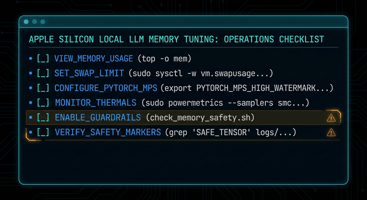
The safe way to use this setting is incremental, reversible, and boring. Those are good qualities in systems work. Start from default, raise in steps, test one model at a time, and watch memory pressure rather than vibes.
Check the current value. If it is 0, you are on the system default policy.
Pick a target that still leaves real headroom. On a 16 GB machine, 14 GB is already adventurous. On a dedicated headless box, you can be bolder.
Restart the inference app. Tools like LM Studio need to re-detect the budget.
Load with a realistic context length. Do not benchmark recklessness.
Reset to default if the machine becomes unpleasant. A responsive Mac beats a heroic screenshot.
# 1. Inspect current policy
sysctl iogpu.wired_limit_mb

# 2. Raise cautiously
sudo sysctl iogpu.wired_limit_mb=12288

# 3. Test, observe, then step up if needed
sudo sysctl iogpu.wired_limit_mb=14336

# 4. Return to default policy
sudo sysctl iogpu.wired_limit_mb=0
If you truly need this on every boot, automate it like any other operational setting. Treat it as host configuration, not as a ritual you half-remember from a video. But also ask the adult question first: if you need a startup hack to run the model comfortably, should you really be running that model on this machine?
The second practical tool is estimation. Run the estimator before the load, not after the error:
# Compare two candidates before wasting time
lms load --estimate-only qwen/qwen3-8b
lms load --estimate-only mistral-small-3.1-24b --context-length 4096

# Use the estimate to choose the smaller model or context
lms load qwen/qwen3-8b --gpu max --context-length 8192
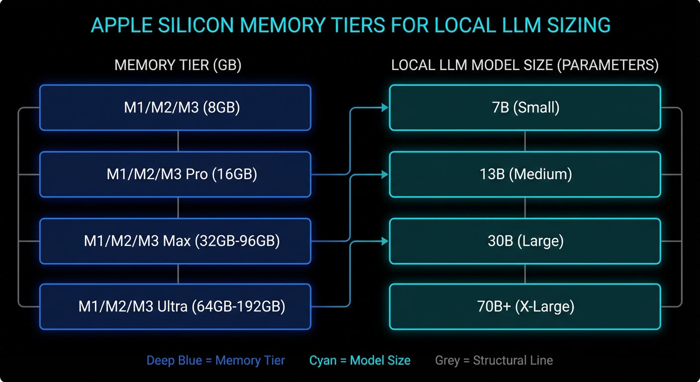
Which Models Actually Make Sense on Different Apple Silicon Macs
This is the section everybody really wants. Exact numbers depend on quant format, context length, backend behaviour, and what else the machine is doing. But the tiers below are realistic enough to save people from magical thinking.
Mac memory tier
Comfortable local LLM tier
Possible with tuning
Usually a bad idea
16 GB
3B to 8B models, 12B class with modest context
Some 14B to 20B quants if you raise the limit and stay disciplined
Large context 20B+, 30B-class models during normal desktop use
24 GB
8B to 14B models, many 20B-class quants
Some 24B to 32B models with sensible context
Treating it like a 64 GB workstation
32 GB to 48 GB
14B to 32B models comfortably, larger contexts for practical work
Some 70B quants on the upper end, especially on dedicated machines
Huge models plus giant context plus desktop multitasking
64 GB and above
30B to 70B-class quants become genuinely usable
Aggressive large-model experimentation on headless or dedicated Macs
Assuming every app uses memory exactly the same way
If you want a one-line rule of thumb, it is this: on a 16 GB machine, think “excellent 7B to 8B box, adventurous 14B box, occasional 20B parlour trick”. On a 24 GB or 32 GB machine, the world gets much nicer. On a 64 GB+ Mac Studio, the conversation changes from “can I load this?” to “is the speed good enough for the inconvenience?”
Also remember that smaller, better-tuned models often beat larger awkward ones for day-to-day coding, search, summarisation, and chat. A responsive 8B or 14B model you actually use is more valuable than a 20B model that only runs when the stars align and Chrome is closed.
The machine class matters more than the myth. Fit the model tier to the memory tier.
When the Default Setting Is Actually Fine
The balanced answer is that the default exists for good reasons. If your Mac is a general-purpose laptop, if you care about battery life and responsiveness, if you run multiple heavy apps at once, or if your local LLM work is mostly 7B to 8B models, leave the setting alone. The system default is often the correct trade-off.
This is also true if your workload is bursty rather than continuous. For occasional summarisation, coding assistance, or local RAG over documents, it is usually better to pick a slightly smaller model and preserve the machine’s overall behaviour. The hidden cost of “bigger model at any price” is that you stop trusting the computer. Once a laptop feels brittle, you use it less. That is bad engineering and worse ergonomics.
There is another subtle point. The wired-limit trick helps most when the machine is effectively dedicated to inference: a headless Mac mini, a quiet box on the shelf, a Mac Studio cluster, or a desktop session where you are willing to treat inference as the primary job. The closer your Mac is to a single-purpose appliance, the more sense this tweak makes.
What To Check Right Now
Check the current policy: run sysctl iogpu.wired_limit_mb and confirm whether you are on the default setting.
Estimate before loading: use lms load --estimate-only so you know the model’s live working set before you commit.
Audit context length: if you are using 16k or 32k context by habit, ask whether 4k or 8k would do the same job.
Watch memory pressure, not just free RAM: Activity Monitor tells you more truth than a single headline number.
Leave deliberate headroom: a model that barely runs is not a production setup, it is a stunt.
Reset when testing is over:sudo sysctl iogpu.wired_limit_mb=0 is a perfectly respectable ending.
Most wins come from estimation, context discipline, and realistic model choice, not from one dramatic command.
The honest headline, then, is better than the clickbait one. Your Mac does not have hidden VRAM waiting to be unlocked like a cheat code in a 1998 driving game. What it has is unified memory, a conservative GPU working-set policy, and enough flexibility that informed users can rebalance the machine for local inference. That is genuinely useful. It is also exactly the sort of useful that punishes people who confuse “possible” with “free”.
Video Attribution
This article was inspired by Alex Ziskind’s video on adjusting the GPU wired-memory limit for local LLM use on Apple Silicon Macs. The video is worth watching for the quick demonstration, particularly if you want to see the behaviour in LM Studio before you touch your own machine.
FFmpeg is what happens when a Swiss Army knife gets a PhD in multimedia and then refuses to use a GUI. It can inspect, trim, remux, transcode, filter, normalise, package, stream, and automate media pipelines with almost rude efficiency. The catch is that it speaks in a grammar that is perfectly logical and completely uninterested in your vibes. Put one option in the wrong place and FFmpeg will not “figure it out”. It will hand you a lesson in command-line causality.
This version is built to be kept open in a tab: a smarter cheatsheet, a modern streaming reference, a compact guide to the commands worth memorising, and a curated collection of official docs plus a few YouTube resources that are actually worth your time. We will cover the fast path, the dangerous path, and the production path.
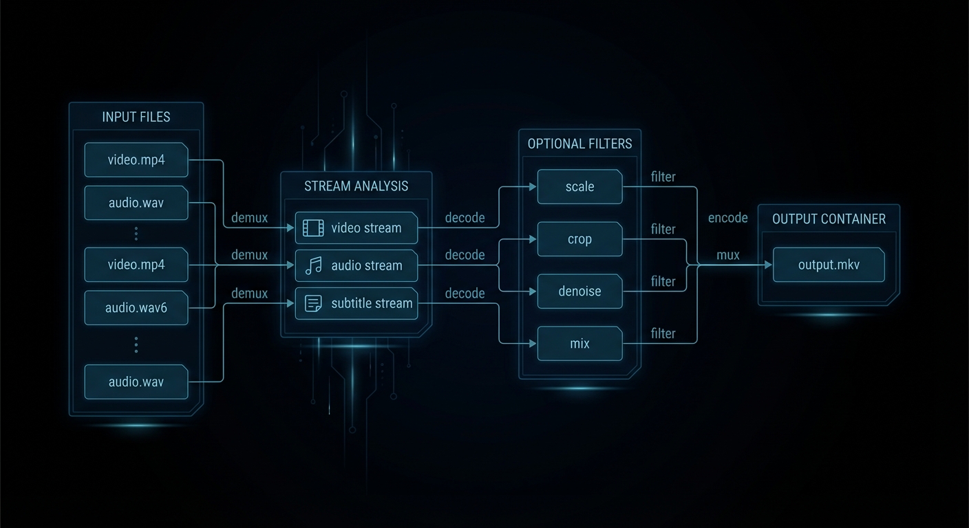
FFmpeg in one picture: streams go in, decisions get made, codecs either behave or get replaced.
First Principles: How FFmpeg Actually Thinks
Most FFmpeg confusion begins with the wrong mental model. Humans think in files. FFmpeg thinks in inputs, streams, codecs, filters, mappings, and outputs. A single file can contain several streams: video, multiple audio tracks, subtitles, chapters, timed metadata. FFmpeg lets you inspect that structure, choose what to keep, decode only what needs changing, then write a new container deliberately.
The core trio is simple. ffmpeg transforms media. ffprobe tells you what is actually in the file. ffplay previews quickly. The smartest FFmpeg habit is also the least glamorous: ffprobe first, ffmpeg second. Guessing stream layout is how people end up with silent video, the wrong commentary track, or subtitles that evaporate on contact with MP4.
“As a general rule, options are applied to the next specified file. Therefore, order is important, and you can have the same option on the command line multiple times.” – FFmpeg Documentation, ffmpeg manual
That rule explains most self-inflicted FFmpeg pain. Input options belong before the input they affect. Output options belong before the output they affect. You are not writing prose. You are wiring a pipeline.
The other distinction worth burning into memory is container versus codec. MP4, MKV, MOV, WebM, TS, and M4A are containers. H.264, HEVC, AV1, AAC, Opus, MP3, ProRes, and DNxHR are codecs. Containers are boxes. Codecs are how the contents were compressed. A huge fraction of “FFmpeg is broken” reports are really “I changed the box and forgot the contents still have rules”.
The command-flow model: inspect streams, decide what gets copied, decide what gets filtered, then write the output on purpose.
The Fast Lane: Steal These Commands First
If you only memorise a dozen FFmpeg moves, make them these. They cover the majority of real-world jobs: inspect, copy, trim, transcode, subtitle, extract, package, and deliver.
Job
Command
Use it when
Inspect a file properly
ffprobe -hide_banner input.mkv
You want the truth about streams before touching anything.
“Streamcopy is useful for changing the elementary stream count, container format, or modifying container-level metadata. Since there is no decoding or encoding, it is very fast and there is no quality loss.” – FFmpeg Documentation, ffmpeg manual
If you remember one performance trick, remember -c copy. It is the difference between “done in a second” and “let me hear all your laptop fans introduce themselves”.
Modern FFmpeg: Streaming, Packaging, and Delivery in 2026
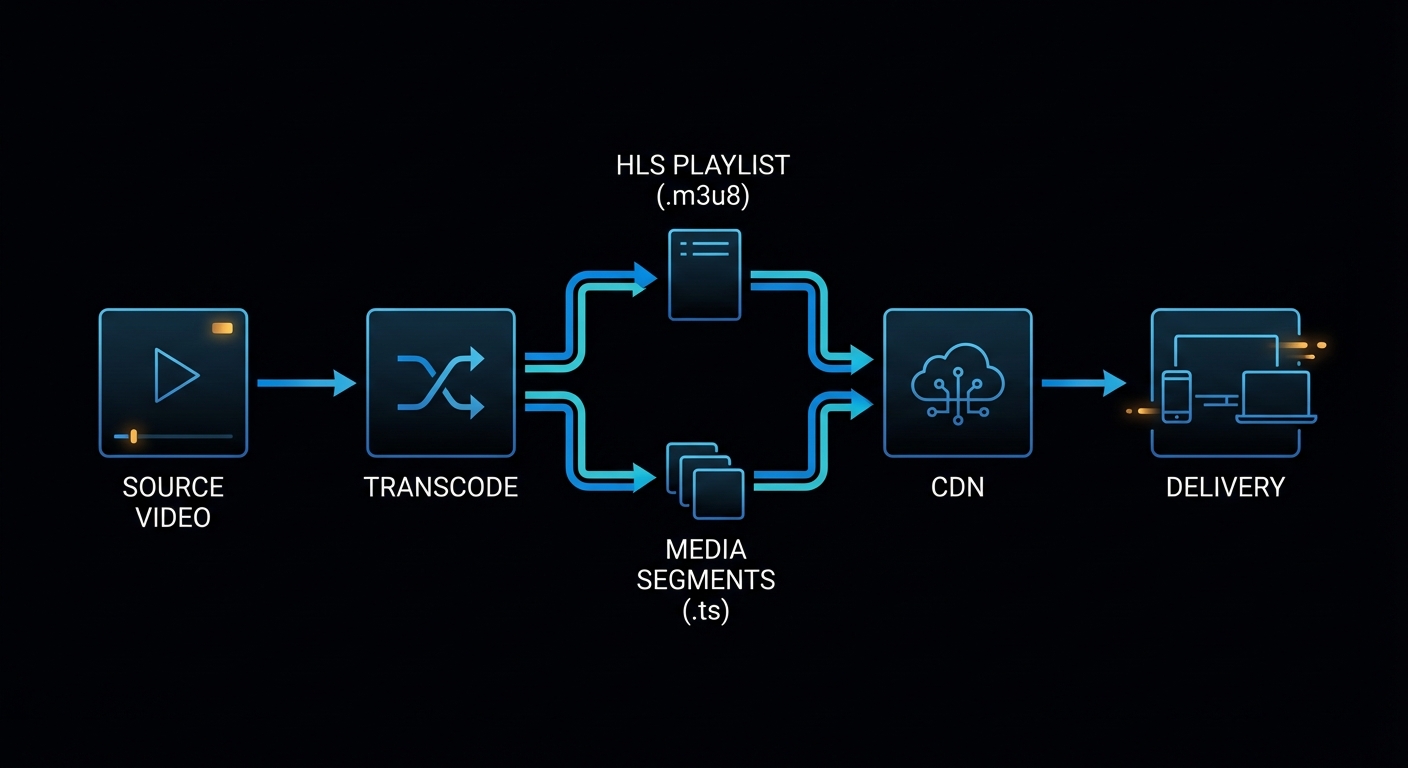
This is where a lot of older FFmpeg write-ups feel dusty. Modern usage is not just “convert AVI to MP4”. It is packaging for adaptive streaming, feeding live ingest pipelines, generating web-safe delivery files, and choosing the correct transport for the job instead of shouting at RTMP because it was popular in 2014.
“WebRTC (Real-Time Communication) muxer that supports sub-second latency streaming according to the WHIP (WebRTC-HTTP ingestion protocol) specification.” – FFmpeg Formats Documentation, WHIP muxer
That is the modern landscape in miniature. FFmpeg is not only a transcoder. It is a packaging and transport tool. Use the right mode for the latency, compatibility, and scale you actually need.
WHIP is interesting because it reflects the current internet, not the old one. If your target is low-latency browser delivery, WHIP and WebRTC are now part of the real conversation, not just interesting acronyms for protocol collectors.
Modern FFmpeg is packaging plus transport plus compatibility engineering, not just transcoding.
Hardware Acceleration Without Lying to Yourself
Modern FFmpeg usage also means knowing when to use hardware encoders. They are fantastic when throughput matters: live streaming, batch transcoding, preview generation, cloud pipelines, and “I have 800 files and would prefer not to age visibly today”. They are not always the best answer for maximum compression efficiency or highest archival quality.
The practical rule is simple. If you need the best quality-per-bit, software encoders like libx264, libx265, and libaom-av1 still matter. If you need speed and acceptable quality, hardware encoders are often the right move.
Platform
Common encoder
Example
NVIDIA
h264_nvenc, hevc_nvenc, sometimes AV1 on newer cards
The mistake people make is assuming hardware encode means “same quality, just faster”. Often it means “faster, different tuning, sometimes larger bitrate for comparable quality”. Be honest about the trade-off. This is not a moral issue. It is an engineering one.
Failure Cases That Keep Reappearing
Hunt and Thomas argue in The Pragmatic Programmer that good tools reward understanding over superstition. FFmpeg is one of the clearest examples of that principle on the command line. Here are the mistakes that keep burning people because they look plausible until you understand what FFmpeg is actually doing.
Case 1: You Wanted Speed, but Also Expected Frame Accuracy
Putting -ss before -i is fast. It is often not frame-accurate. That is a feature, not a betrayal.
Case 3: FFmpeg Picked the Wrong Streams Because You Left It to Fate
Auto-selection works until the source has multiple languages, commentary, descriptive audio, or subtitles. At that point, the polite thing to do is map explicitly.
# Ambiguous and sometimes unlucky
ffmpeg -i movie.mkv -c copy output.mp4
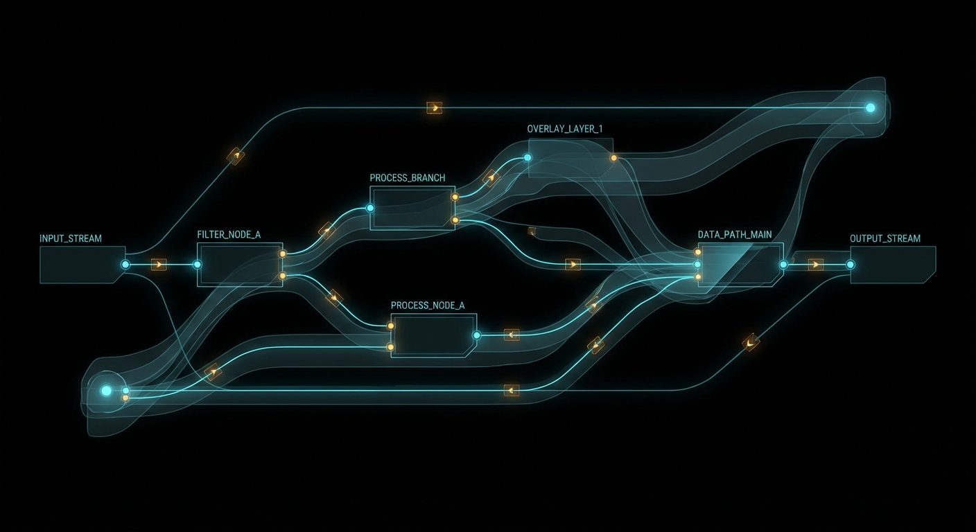
Filtergraphs stop being scary the moment you read them as labelled dataflow instead of punctuation.
The Best Collection to Bookmark
If you want the strongest FFmpeg learning stack from basic to advanced, use this order. Not because it is trendy, but because it respects how people actually learn complicated tools: truth first, intuition second, repetition third.
The rule is simple: use YouTube for intuition, use the official docs for truth. The people who confuse those two categories usually end up with very confident commands and very confusing output.
What to Check Right Now
Adopt one boring, reliable web delivery recipe – H.264, AAC, and -movflags +faststart will solve more problems than exotic cleverness.
Use ffprobe before every important transcode – that one habit prevents a ridiculous amount of avoidable breakage.
Reach for -c copy first when no transformation is needed – it is faster and lossless, which is suspiciously close to magic.
Move from RTMP-only thinking to transport-aware thinking – HLS for compatibility, DASH for adaptive packaging, SRT for rougher networks, WHIP for low-latency browser workflows.
Pick hardware encoders when throughput matters and software encoders when efficiency matters – this is the real trade-off, not ideology.
Build a private snippets file – five good FFmpeg recipes will do more for your sanity than fifty vague memories.
FFmpeg rewards the same engineering habit that every serious tool rewards: inspect first, be explicit, automate the boring parts, and choose the transport and packaging that fit the real system in front of you. Do that and FFmpeg stops feeling like cryptic wizardry and starts feeling like infrastructure. Which is exactly what it is.
WordPress ships slow. Not broken-slow, but “a friend who takes 4 seconds to answer a yes/no question” slow. The default stack serves every request through PHP, loads jQuery plus its migration shim for a site that hasn’t used jQuery 1.x in a decade, ships full-resolution images to mobile screens, and trusts the browser to figure out layout before it has seen a single pixel. Google’s PageSpeed Insights will hand you a score in the 40s and a wall of red, and you’ll spend an afternoon convinced the problem is your hosting. It is not. This guide walks through every layer of the fix, from OPcache to image compression to full-page static caching, and explains exactly why each one moves the needle.
From a 49 on mobile to 95+: what a full stack optimisation actually looks like.
What PageSpeed Is Actually Measuring
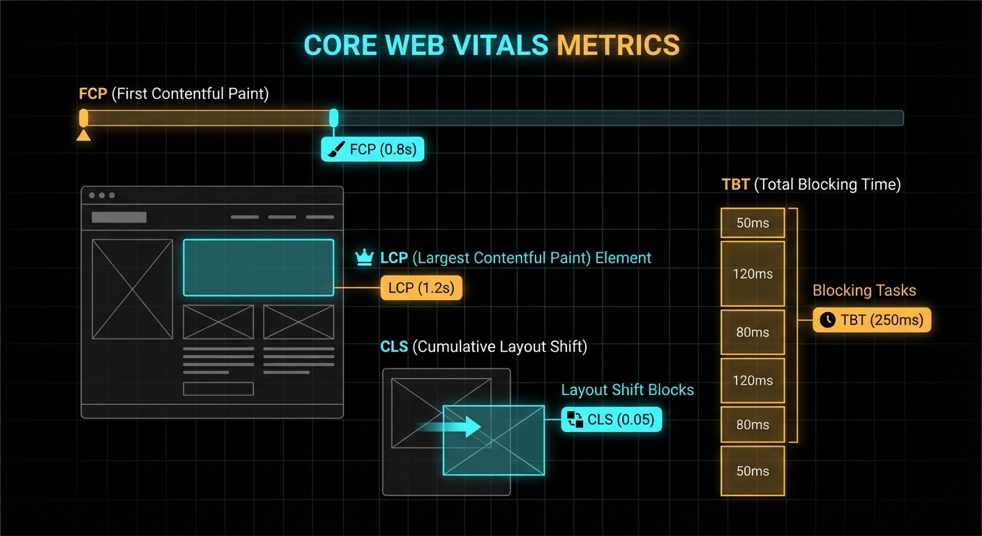
Before you touch a file, understand what you are chasing. PageSpeed Insights (backed by Lighthouse) reports five metrics, each targeting a distinct user experience moment:
First Contentful Paint (FCP) — the moment the browser renders any content at all. Dominated by render-blocking CSS and JS in the <head>.
Largest Contentful Paint (LCP) — when the biggest visible element finishes loading. Usually your hero image or a large heading. Google’s threshold for “good” is under 2.5 seconds.
Total Blocking Time (TBT) — the sum of all long tasks on the main thread between FCP and Time to Interactive. Every JavaScript file parsed synchronously contributes here. Zero is the target.
Cumulative Layout Shift (CLS) — how much the page jumps around as assets load. Images without explicit width and height attributes are the most common culprit. Target: under 0.1.
Speed Index — a composite of how fast the visible content populates. Think of it as the integral under the FCP curve.
“LCP measures the time from when the page first starts loading to when the largest image or text block is rendered within the viewport.” — web.dev, Largest Contentful Paint (LCP)
The audit starts with a fresh Chrome incognito load over a throttled 4G connection. Any caching your browser has built up is irrelevant; PageSpeed is measuring the cold-load experience of a first-time visitor on a mediocre phone connection. Every millisecond counts from the first TCP packet.
Layer 1: Images — The Biggest Win by Far
Images are almost always the single largest contributor to poor LCP on a self-hosted WordPress blog. A typical upload flow is: photographer exports a 4000×3000 JPEG at 90% quality, editor uploads it via the WordPress media library, WordPress generates a handful of named thumbnails but leaves the original untouched, and the theme serves the full 8 MB original to every visitor. The browser then scales it down in CSS. The bytes still travel across the wire.
Case 1: Full-Resolution Originals Served to Every Visitor
When a theme uses get_the_post_thumbnail_url() without specifying a size, or uses a custom field storing the original upload URL, WordPress happily hands out the unprocessed original.
# Find images over 200KB in your uploads directory
find /var/www/html/wp-content/uploads -name "*.jpg" -size +200k | wc -l

# Batch-resize and compress in place with ImageMagick
# Max 1600px wide, JPEG quality 75, strip metadata
find /var/www/html/wp-content/uploads -name "*.jpg" -o -name "*.jpeg" | \
  xargs -P4 -I{} mogrify -resize '1600x>' -quality 75 -strip {}

find /var/www/html/wp-content/uploads -name "*.png" | \
  xargs -P4 -I{} mogrify -quality 85 -strip {}
On a typical blog, this step alone drops total image payload by 60–80%. Run it, clear your cache, and re-run PageSpeed before touching anything else. On this site, 847 images went from an average of 380 KB down to 62 KB.
Case 2: Images Without Width and Height Attributes (CLS Killer)
The browser cannot reserve space for an image before it downloads if the HTML does not declare its dimensions. The result: as images load in, everything below them jumps down the page. Google counts every pixel of that shift against your CLS score.
WordPress 5.5+ adds these attributes for images inserted via the block editor, but anything in post content from older posts, theme templates, or plugins is a wildcard. The fix is a PHP filter that scans every <img> tag and injects dimensions if they are missing:
The browser’s preload scanner will not discover a CSS background image or a lazily-loaded image until it builds the render tree. If your LCP element is a featured image, preload it in the <head> so the browser fetches it at the same time as the HTML:
add_action( 'wp_head', 'sudoall_preload_lcp_image', 1 );
function sudoall_preload_lcp_image() {
    if ( ! is_singular() ) return;
    $thumb_id = get_post_thumbnail_id();
    if ( ! $thumb_id ) return;
    $src = wp_get_attachment_image_url( $thumb_id, 'large' );
    if ( $src ) {
        echo '' . "\n";
    }
}
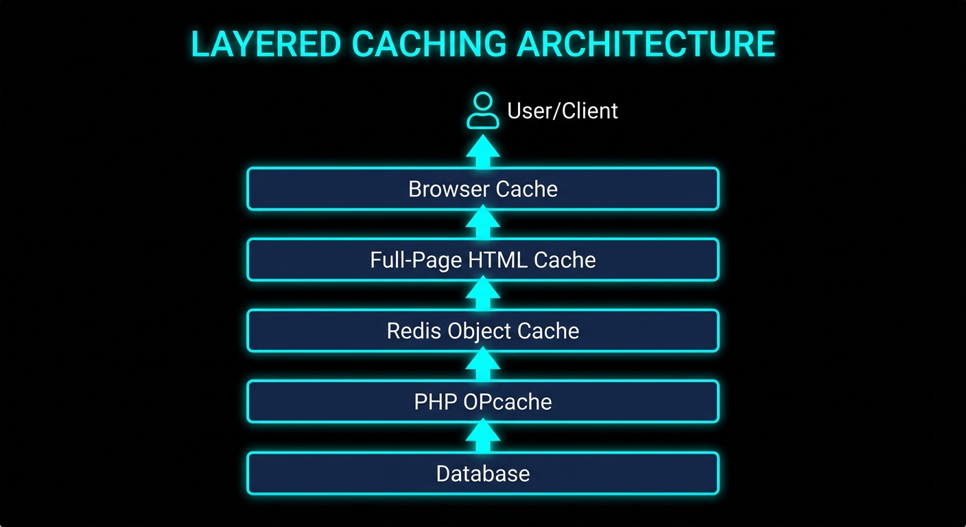
The full caching stack: each layer eliminates a different class of latency.
Layer 2: The Caching Stack
WordPress without caching is a PHP application that rebuilds every page from scratch on every request: parse PHP, load plugins, run sixty-odd database queries, render templates, and flush the output buffer to the client. A modern server can do this in 200–400 ms on a good day. Under any real traffic, MySQL connection queues start forming and TTFB climbs past 800 ms. Add the time for a mobile browser on 4G to receive and render those bytes and you have a 3-second LCP before the CSS even loads.
The solution is layered caching. Think of each layer as an earlier exit that avoids all the work below it.
PHP OPcache (Bytecode Caching)
PHP compiles every source file to bytecode before executing it. Without OPcache, this happens on every request. With OPcache enabled, the compiled bytecode is stored in shared memory and reused. For a WordPress site with hundreds of PHP files across core, plugins, and the theme, this is a substantial saving.
; In php.ini or a custom opcache.ini
opcache.enable=1
opcache.memory_consumption=128
opcache.interned_strings_buffer=16
opcache.max_accelerated_files=10000
opcache.revalidate_freq=60
opcache.fast_shutdown=1
Verify it is active inside the container: docker exec your-wordpress-container php -r "echo opcache_get_status()['opcache_enabled'] ? 'OPcache ON' : 'OFF';"
Redis Object Cache (Database Query Caching)
WordPress calls $wpdb->get_results() for things like sidebar widget listings, navigation menus, and term lookups on every page. Redis Object Cache (the plugin by Till Krüss) hooks into WordPress’s WP_Object_Cache API and stores query results in Redis, a sub-millisecond in-memory store. Repeat queries skip the database entirely.
After connecting Redis, activate the Redis Object Cache plugin from the WordPress admin. The first page load primes the cache; subsequent loads skip the DB for cached data.
WP Super Cache (Full-Page Static HTML)
The deepest cache, and the most impactful for TTFB. WP Super Cache writes the fully rendered HTML of each page to disk as a static file. Apache (via mod_rewrite) serves this file directly, bypassing PHP and MySQL entirely. A cached page response time drops from 200–400 ms to under 5 ms.
# .htaccess — serve cached static files directly via mod_rewrite
# (WP Super Cache generates these rules; this is the HTTPS variant)
RewriteEngine On
RewriteBase /
RewriteCond %{REQUEST_METHOD} !POST
RewriteCond %{QUERY_STRING} ^$
RewriteCond %{HTTP:Cookie} !^.*(comment_author|wordpress_[a-f0-9]+|wp-postpass).*$
RewriteCond %{HTTPS} on
RewriteCond %{DOCUMENT_ROOT}/wp-content/cache/supercache/%{HTTP_HOST}%{REQUEST_URI}index-https.html -f
RewriteRule ^ wp-content/cache/supercache/%{HTTP_HOST}%{REQUEST_URI}index-https.html [L]
Cache Warm-Up: Don’t Leave Visitors on the Cold Path
The first visitor to any page after a cache flush or server restart hits the full PHP stack. For a blog with 100 published posts, that is 100 potential cold-hit requests. The fix is a warm-up script that crawls all published URLs immediately after any flush:
#!/bin/bash
# warm-cache.sh — pre-warm WP Super Cache for all published posts and pages
URLS=$(mysql -h 127.0.0.1 -u root -p"${MYSQL_ROOT_PASSWORD}" sudoall_prod \
  -se "SELECT CONCAT('https://sudoall.com', post_name) FROM wp_posts \
       WHERE post_status='publish' AND post_type IN ('post','page');")

echo "$URLS" | xargs -P8 -I{} curl -s -o /dev/null -w "%{url_effective} %{http_code}\n" {}
echo "Cache warm-up complete."
Schedule this with cron: 5 * * * * /srv/www/site/warm-cache.sh. Every hour, right after the cache TTL expires, it re-primes all pages.
Core Web Vitals: each metric maps to a specific user experience moment.
Layer 3: JavaScript and CSS Delivery
A browser can only do one thing at a time on the main thread. A <script> tag without defer or async halts HTML parsing completely until the script is downloaded, compiled, and executed. Stack ten plugins each adding a synchronous script to the <head> and your TBT climbs into the hundreds of milliseconds before the user sees a single pixel.
Defer Non-Critical JavaScript
WordPress’s script_loader_tag filter lets you inject defer or async onto any registered script handle. Add defer to everything that doesn’t need to run before the DOM is painted:
WordPress loads jquery-migrate by default as a compatibility shim for plugins still using deprecated jQuery APIs from the 1.x era. If your theme and plugins don’t need it, it is dead weight on every page load. The correct removal (without breaking jQuery) is via wp_default_scripts:
If your blog has code blocks, you’re probably loading a syntax highlighter like highlight.js on every page, including pages with no code at all. The fix: use IntersectionObserver to load the highlighter only when a <pre><code> block actually enters the viewport.
document.addEventListener('DOMContentLoaded', function () {
  var codeBlocks = document.querySelectorAll('pre code');
  if (!codeBlocks.length) return;  // no code on this page — don't load anything

  function loadHighlighter() {
    if (window._hljs_loaded) return;
    window._hljs_loaded = true;
    var link = document.createElement('link');
    link.rel = 'stylesheet';
    link.href = '/wp-content/themes/your-theme/css/arcaia-dark.css';
    document.head.appendChild(link);
    var script = document.createElement('script');
    script.src = '/wp-content/plugins/...highlight.min.js';
    script.onload = function () { hljs.highlightAll(); };
    document.head.appendChild(script);
  }

  if ('IntersectionObserver' in window) {
    var obs = new IntersectionObserver(function (entries) {
      entries.forEach(function (e) { if (e.isIntersecting) { loadHighlighter(); obs.disconnect(); } });
    });
    codeBlocks.forEach(function (el) { obs.observe(el); });
  } else {
    setTimeout(loadHighlighter, 2000);  // fallback for older browsers
  }
});
Async Load Non-Critical CSS
Google Fonts, icon libraries, and syntax-highlight stylesheets are not needed before the first paint. The media="print" trick loads them asynchronously: a print stylesheet is non-blocking, and the onload handler switches it to all once it has downloaded.
Important caveat: do not async-load any CSS that controls above-the-fold layout. If Bootstrap or your grid system loads asynchronously, elements will visibly jump as it arrives, spiking your CLS score. Layout-critical CSS must stay synchronous or be inlined in the <head>.
Remove Unused Block Library CSS
If you don’t use Gutenberg blocks on the front-end, WordPress is loading wp-block-library.css (and related stylesheets) on every page for nothing. Dequeue them:
Deferred vs blocking scripts: the same assets, in the same order, with a completely different effect on main-thread availability.
Layer 4: Browser Caching and Static Asset Versioning
Every returning visitor should get CSS, JS, fonts, and images from their local browser cache, not your server. Without explicit cache headers, most browsers apply heuristic caching, which is inconsistent and often too short. Set them explicitly in .htaccess:
<IfModule mod_expires.c>
    ExpiresActive On
    ExpiresByType text/css              "access plus 1 year"
    ExpiresByType application/javascript "access plus 1 year"
    ExpiresByType image/jpeg            "access plus 1 year"
    ExpiresByType image/png             "access plus 1 year"
    ExpiresByType image/webp            "access plus 1 year"
    ExpiresByType font/woff2            "access plus 1 year"
    ExpiresByType text/html             "access plus 1 hour"
</IfModule>

<IfModule mod_headers.c>
    <FilesMatch "\.(css|js|jpg|jpeg|png|webp|woff2|gif|ico|svg)$">
        Header set Cache-Control "public, max-age=31536000, immutable"
    </FilesMatch>
</IfModule>
One year is fine for assets provided you bust the cache when they change. The standard approach: append a version query string. The common mistake in WordPress themes is using time() as the version, which generates a new query string on every page load and defeats caching entirely:
// ❌ This busts the cache on every single request
wp_enqueue_style( 'my-theme', get_stylesheet_uri(), [], time() );

// ✅ This respects the cache until you actually change the file
wp_enqueue_style( 'my-theme', get_stylesheet_uri(), [], '1.2.6' );
“The ‘immutable’ extension in a Cache-Control response header indicates to a client that the response body will not change over time… clients should not send conditional revalidation requests for the response.” — RFC 8246, HTTP Immutable Responses
When These Optimisations Are Overkill
Not every site needs all of this. If you run a private internal tool, a staging site, or a low-traffic blog where perceived performance genuinely doesn’t matter, a full caching stack is added complexity for no real user benefit. Redis and WP Super Cache both introduce cache invalidation problems: publish a post, and the homepage is stale until the next warm-up. For a site with a small team editing content frequently, you’ll spend more time debugging stale pages than you save in load times.
Similarly, the async CSS trick is wrong for sites where the theme’s layout CSS is above-the-fold critical. Apply it only to supplementary stylesheets like icon libraries and syntax themes. When in doubt, keep layout CSS synchronous and async everything else.
What to Check Right Now
Run PageSpeed Insights — pagespeed.web.dev on your homepage. Identify your worst metric: is it TBT (JavaScript), LCP (images or no cache), or CLS (missing dimensions)?
Check image sizes — find /var/www/html/wp-content/uploads -name "*.jpg" -size +500k | wc -l from inside your container. If the count is more than 0, start with mogrify.
Verify OPcache — php -r "var_dump(opcache_get_status()['opcache_enabled']);" inside the PHP container. Should be bool(true).
Check for jquery-migrate — view source on your homepage and search for jquery-migrate in the script tags. If it is there and your theme doesn’t need legacy jQuery, remove it.
Check time() in enqueue calls — grep -r "time()" wp-content/themes/your-theme/. Replace any occurrence used as a version number with a static string.
Verify Cache-Control headers — curl -I https://yourdomain.com/wp-content/themes/your-theme/style.css | grep -i cache. You should see max-age=31536000.
Check for full-page caching — curl -s -I https://yourdomain.com/ | grep -i x-cache. If WP Super Cache is working, the response should come back in under 20 ms from a warm cache.
Protect your theme from WP updates — add Update URI: false to style.css and use a must-use plugin to filter site_transient_update_themes if the theme has a unique slug that could match a public theme.
Redis is one of those tools you adopt on a Monday and depend on completely by Thursday. It’s fast, it’s simple, and its data structures make your brain feel big. But buried inside Redis is a feature that has been silently causing production incidents for years: multiple logical databases within a single instance. You’ve probably used it. You might be using it right now. And there’s a very good chance it’s going to bite you at the worst possible moment.
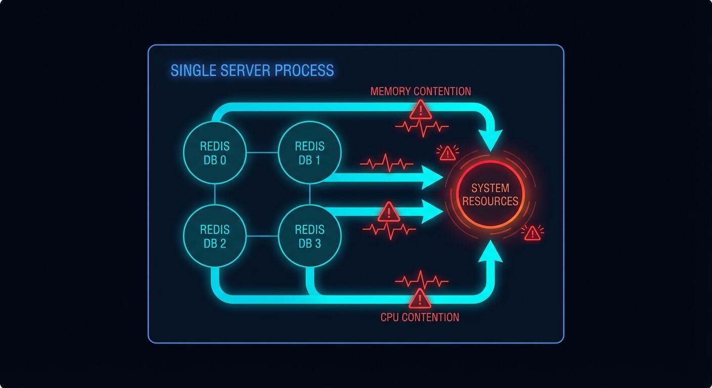
Multiple Redis databases: they look separate, but they live in the same house and share everything
What Redis Databases Actually Are
Redis ships with 16 databases numbered 0 through 15. You switch between them using the SELECT command. Each database has its own keyspace, which means keys named user:1 in database 0 are completely separate from user:1 in database 5. On the surface this looks like proper isolation. It is not.
The Redis documentation itself is blunt about this. From the official docs on SELECT:
“Redis databases should not be used as a way to separate different application data. The proper way to do this is to use separate Redis instances.” — Redis documentation, SELECT command
This isn’t buried in a footnote. It’s right there in the command reference. And yet, multiple databases are everywhere in production. Why? Because they’re convenient. Running one Redis process is simpler than running three. And the keyspace separation looks exactly like the isolation you actually need.
# This looks clean and organised
redis-cli SELECT 0   # application sessions
redis-cli SELECT 5   # background pipeline processing
redis-cli SELECT 10  # lightweight caching

# What you think you have: three isolated stores
# What you actually have: three buckets in one leaking tank
The Shared Resource Problem: What Actually Goes Wrong
Every Redis database within a single instance shares the same server process. That means one pool of memory, one CPU thread (Redis is single-threaded for commands), one network socket, one set of configuration limits. When you SELECT a different database number, you’re not switching to a different process. You’re just telling Redis to look in a different keyspace. The underlying machinery is identical.
Kleppmann in Designing Data-Intensive Applications explains why this matters at a systems level: shared resources without isolation boundaries mean a fault in one subsystem propagates to all others. He’s talking about distributed systems broadly, but the principle applies here with brutal precision. Your databases are not subsystems. They are namespaces sharing a single subsystem.
Here is what that looks like in practice.
Case 1: Memory Eviction Wipes Your Cache
You configure a single Redis instance with maxmemory 4gb and maxmemory-policy allkeys-lru. You use database 5 for pipeline job queues and database 10 for caching API responses. Your pipeline goes through a burst period and starts writing thousands of large job payloads into database 5.
# redis.conf
maxmemory 4gb
maxmemory-policy allkeys-lru

# Your pipeline flooding database 5
import redis
r = redis.Redis(db=5)
for job in burst_of_10k_jobs:
    r.set(f"job:{job.id}", job.payload, ex=3600)  # big payloads

# Meanwhile in your web app...
cache = redis.Redis(db=10)
result = cache.get("api:products:page:1")  # returns None — evicted
# Cache miss. Your DB gets hammered.
When Redis hits the memory limit it runs LRU eviction across all keys in all databases. It doesn’t know or care that database 10’s cache keys are serving live user traffic. It just evicts whatever is least recently used. Your carefully populated cache gets gutted to make room for the pipeline. Cache hit rate goes from 85% to 12%. Your database gets hammered. Everyone’s pager goes off at 2am.
This is not a hypothetical. It’s a well-documented operational failure mode.
Case 2: FLUSHDB Takes Down More Than You Planned
You’re cleaning up stale test data. You connect to what you think is the test database and run FLUSHDB. Redis flushes database 0. Your sessions are in database 0. Your production users are now all logged out simultaneously.
# Developer runs this thinking they're on the test DB
redis-cli -n 0 FLUSHDB

# But your sessions were also on DB 0
# Every logged-in user just got kicked out
# Support tickets: many
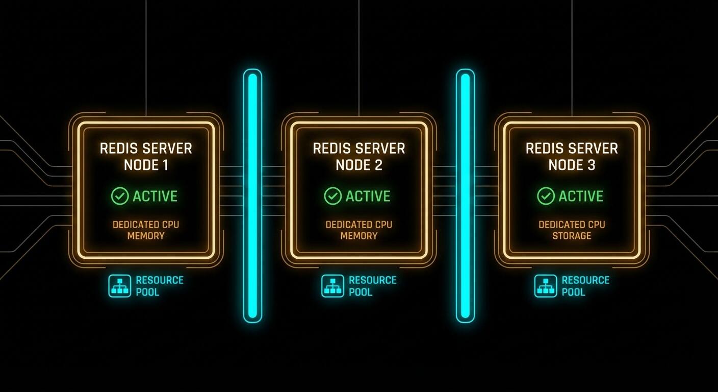
With separate instances, this failure mode is impossible. You’d have to explicitly connect to the production instance and deliberately flush it. The separate instance is an actual boundary. The database number is just a label.
Case 3: FLUSHALL Is Always a Disaster
Someone runs FLUSHALL to clean up a database. FLUSHALL wipes every database in the instance. It doesn’t ask which one. If all your databases are in one Redis instance, this single command takes out everything: your sessions, your pipeline queues, your caches, your temporary data. Everything. Simultaneously.
# Looks like it's cleaning just one thing
redis-cli FLUSHALL  # deletes EVERY database (0 through 15)

# Equivalent damage: one wrong command vaporises
# db 0: sessions     → all users logged out
# db 5: pipeline     → all queued jobs lost
# db 10: cache       → cache cold, DB under full load
Case 4: A Slow Operation Blocks Everything
Redis is single-threaded for command execution. A slow operation in one database blocks commands in all other databases. You’re running a large KEYS * scan in database 5 during maintenance (yes, you know not to do this, but someone does it anyway). It takes 800ms. For 800ms, every GET in database 10 queues up. Your cache layer is unresponsive. Your application timeout counters tick.
# Someone runs this on db 5 "just to debug something"
redis-cli -n 5 KEYS "*pipeline*"
# Returns after 800ms

# During those 800ms, database 10 clients are blocked:
cache.get("user:session:abc123")  # waiting... waiting...
# Your app's 500ms timeout fires
# HTTP 504 responses hit your users
With separate instances, a blocked db 5 instance doesn’t touch db 10’s instance. The processes are independent.
One process, one thread, one memory pool: a bad day in database 5 is a bad day everywhere
The Redis Cluster Problem: A Hard Wall
Here’s a constraint that isn’t optional or configurable. Redis Cluster, which is the standard approach for horizontal scaling and high availability in production, only supports database 0.
“Redis Cluster supports a single database, and the SELECT command is not allowed.” — Redis Cluster specification
If you’ve built your application around multiple database numbers and you later need to scale horizontally with Redis Cluster, you’re stuck. You have to refactor your data access layer, migrate your keys, and retest everything. The cost of the “convenient” multi-database approach arrives as a large refactoring bill exactly when you can least afford it: when your traffic is growing.
The Proper Pattern: Separate Instances
The correct approach is to run a separate Redis instance for each logical use case. This is not complicated. Redis has a tiny footprint. Running three instances uses almost no additional overhead compared to running one with three databases.
# redis-pipeline.conf
port 6380
maxmemory 1gb
maxmemory-policy noeviction  # pipeline jobs must NOT be evicted
save 900 1                   # persist pipeline jobs to disk

# redis-cache.conf
port 6381
maxmemory 2gb
maxmemory-policy allkeys-lru  # cache should evict LRU freely
save ""                       # no persistence needed for cache

# redis-sessions.conf
port 6382
maxmemory 512mb
maxmemory-policy volatile-lru  # only evict keys with TTL set
save 60 1000                   # persist sessions more aggressively
Notice what this gives you that you absolutely cannot have with multiple databases. Each instance has its own maxmemory and its own maxmemory-policy. Your pipeline instance uses noeviction because job loss is unacceptable. Your cache instance uses allkeys-lru because cache misses are fine. Your session instance uses volatile-lru and persists aggressively. These policies are mutually exclusive requirements. You cannot satisfy them with a single configuration file.
# Application connections — clean and explicit
import redis

pipeline_redis = redis.Redis(host='localhost', port=6380)
cache_redis    = redis.Redis(host='localhost', port=6381)
session_redis  = redis.Redis(host='localhost', port=6382)

# Now a pipeline burst doesn't evict cache entries
# A FLUSHDB on cache doesn't touch sessions
# A slow pipeline scan doesn't block session lookups
# Each can scale, replicate, and fail independently
The Pragmatic Programmer’s core principle of orthogonality applies perfectly here: components that have nothing to do with each other should not share internal state. Your pipeline and your cache are orthogonal concerns. Coupling them through a shared Redis process violates that principle, and you pay for the violation eventually.
Separate instances: different ports, different configs, different memory policies, zero cross-contamination
How to Migrate Away From Multiple Databases
If you’re already using multiple databases in production, the migration is straightforward but requires care. Here’s the logical path.
Step 1: Inventory your databases. Connect to your Redis instance and check what’s actually living in each database.
# Check key counts per database
redis-cli INFO keyspace
# Output shows something like:
# db0:keys=1240,expires=1100,avg_ttl=86300000
# db5:keys=340,expires=340,avg_ttl=3598000
# db10:keys=5820,expires=5820,avg_ttl=299000
Step 2: Start new instances before touching the old one. Spin up your new Redis instances with appropriate configs for each use case. Don’t migrate anything yet.
Step 3: Dual-write during transition. Update your application to write to both the old database number and the new dedicated instance. Reads still come from the old instance. This gives you a warm new instance without a cold-start cache miss storm.
# Transition period: write to both, read from old
def set_cache(key, value, ttl):
    old_redis.select(10)
    old_redis.setex(key, ttl, value)
    new_cache_redis.setex(key, ttl, value)  # warm the new instance

def get_cache(key):
    return old_redis.get(key)  # still reading from old
Step 4: Flip reads, then remove dual-write. Once the new instance has a reasonable warm state, flip reads to the new instance. Monitor cache hit rates. Once stable for a day or two, remove the dual-write to the old database number.
Step 5: Verify and clean up. After all traffic is on dedicated instances, verify the old database numbers are empty and decommission them.
The migration path: inventory, spin up, dual-write, flip, clean up
When Multiple Databases Are Actually Fine
It would be unfair to say multiple databases are always wrong. There are genuine use cases:
Local development and unit tests — when you want to isolate test data from dev data on a single machine without the overhead of multiple processes. Database 0 for your running dev server, database 1 for tests that get flushed between runs.
Organisational separation within a single application — separating sessions, cache, and queues within one application that has identical resource requirements and tolerates the same eviction policy. This is the original intended use case.
Very small applications with negligible traffic — where the Redis instance is nowhere near its limits and you simply want namespace separation without the operational overhead.
The moment you have meaningfully different workloads, different eviction requirements, or need horizontal scaling, multiple databases stop being an organisational convenience and start being a liability.
What to Check Right Now
Run INFO keyspace — if you see more than db0 in production with significant key counts, you have work to do.
Check your maxmemory-policy — one policy cannot serve all use cases correctly. If you have both pipeline jobs and cache data, you need different policies.
Check for Redis Cluster in your roadmap — if it’s there, multiple databases will block you. Start planning the migration now, before you need to scale.
Audit your FLUSHDB and FLUSHALL usage — in scripts, Makefiles, CI pipelines, anywhere. Know exactly what would be affected if one of those runs in the wrong context.
Review slow query logs — check if slow commands in one database are causing latency spikes visible in your application metrics at the same timestamps.
Redis is an extraordinary tool. It earns its place in almost every production stack. But its database feature was designed for a simpler era when “run one Redis for everything” was the standard advice. The standard has moved on. Your architecture should too.
An “oracle” in this context is a component that knows something the LLM doesn’t — typically the structure of the system. The agent edits code or config; the oracle has a formal model (e.g. states, transitions, invariants) and can answer questions like “is there a stuck state?” or “does every path have a cleanup?” The oracle doesn’t run the code; it reasons over the declared structure. So the agent has a persistent, queryable source of truth that survives across sessions and isn’t stored in the model’s context window. That’s “persistent architectural memory.”
Why it helps: the agent (or the human) can ask the oracle before or after a change. “If I add this transition, do I introduce a dead end?” “Which states have no error path?” The oracle answers from the formal model. So you’re not relying on the agent to remember or infer the full structure; you’re relying on a dedicated store that’s updated when the structure changes and queried when you need to verify or plan. The agent stays in the “how do I implement?” role; the oracle is in the “what is the shape?” role.
Building an oracle means maintaining a representation of the system (states, transitions, maybe invariants) that stays in sync with the code or config. That can be manual (you write the spec) or semi-automated (the agent or a tool proposes updates to the spec when code changes). The oracle then runs checks or answers queries over that representation. For agentic systems, the oracle is the “memory” that the agent lacks: a place to look up structural facts instead of re-deriving them from source every time.
The approach is especially useful when multiple agents or humans work on the same codebase. The oracle is the single source of truth for “what’s the intended structure?” so that everyone — human or agent — can check their changes against it.
Expect more tooling that provides oracle-like structural views and checks, and tighter integration with agentic workflows so that agents can query before they act.