
Ichimoku Trading Series: Part 9 of 10 | ← Previous | View Full Series
The Optimisation Challenge
We have two key parameters to tune:
- ATR Multiplier (stop-loss distance)
- Risk-Reward Multiplier (take-profit distance)
Grid Search Approach
# Parameter ranges
atr_range = np.arange(1.0, 2.5, 0.1)  # 1.0 to 2.4
rr_range  = np.arange(1.0, 3.0, 0.1)  # 1.0 to 2.9

# Run optimization
stats, heatmap = bt.optimize(
    atr_mult_sl=atr_range,
    rr_mult_tp=rr_range,
    maximize="Return [%]",
    constraint=lambda param: param.rr_mult_tp >= 1,
    return_heatmap=True
)
Multi-Asset Testing
Test across multiple instruments to ensure robustness:
SYMBOLS = [
"EURUSD=X", "USDJPY=X", "GBPUSD=X",
"AUDUSD=X", "USDCHF=X", "USDCAD=X", "NZDUSD=X"
]
def run_all_assets(symbols, start, end, interval, cash, commission):
rows = []
for sym in symbols:
try:
stats, _, _ = run_backtest(
symbol=sym, start=start, end=end,
interval=interval, cash=cash, commission=commission,
show_plot=False
)
rows.append({
"Symbol": sym,
"Return [%]": stats.get("Return [%]"),
"MaxDD [%]": stats.get("Max. Drawdown [%]"),
"Win Rate [%]": stats.get("Win Rate [%]"),
"Trades": stats.get("# Trades"),
})
except Exception as e:
print(f"Warning {sym}: {e}")
return pd.DataFrame(rows)
summary = run_all_assets(SYMBOLS, START, END, INTERVAL, CASH, COMMISSION)
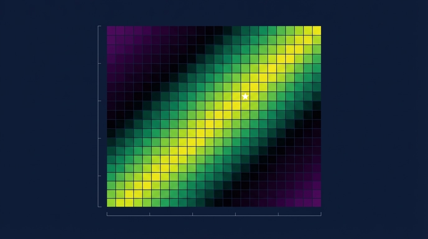
print(summary)Understanding the Heat Map
The optimisation produces a heat map showing returns for each parameter combination.
Key Pattern: The Diagonal
“Notice those ridges, those clusters of returns… It is showing this decreasing slope. And this is totally normal.”
Why the diagonal?
- High ATR multiplier = wider stop-loss → needs lower R:R
- Low ATR multiplier = tighter stop-loss → can use higher R:R
“Either you have a high stop-loss distance and a low risk-reward ratio, OR you have a low ATR multiplier and a high risk-reward ratio — which actually is working the best for this strategy.”
Optimal Zone
| ATR Mult | RR Mult | Expected Return |
|---|---|---|
| 1.0-1.3 | 2.5-2.9 | 35-43% |
| 1.4-1.7 | 1.8-2.2 | 25-35% |
| 1.8-2.4 | 1.0-1.5 | 15-25% |
Heat Map Visualisation Code
import plotly.express as px

def plot_heatmap(heat, metric_name="Return [%]", min_return=10):
    """Plot optimization heatmap with threshold filtering."""

    # Pivot to matrix form
    zdf = heat.pivot(index="atr_mult_sl", columns="rr_mult_tp", values=metric_name)

    # Create heatmap
    fig = px.imshow(
        zdf.values,
        x=zdf.columns,
        y=zdf.index,
        color_continuous_scale="Viridis",
        labels=dict(x="RR Multiplier", y="ATR Multiplier", color=metric_name),
        title=f"Optimization Heatmap - {metric_name}"
    )

    return fig
Avoiding Overfitting
- Test on multiple assets, not just one
- Use walk-forward analysis
- Look for robust parameter zones, not single optimal points
- Consider the diagonal pattern — many combinations work